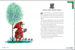
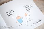
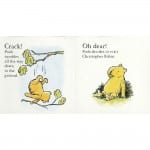
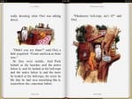
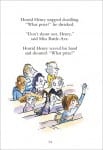
Before I start my storyboard I did some research in some different ways some children’s picture books have laid out their text and images.
The design layout that most appealed to me was the Winnie the Pooh designs. I like these because the images are purposefully created to look as if they have been hand drawn, with the text placed around the images in the blank spaces. By placing the text almost ‘wrapped around’ the image I think it closely links them together, reinforcing the warm, family-orientated, comforting appeal the Winnie the Pooh books aim to create. In my storyboard I will use the books as inspiration for my layout.
