Front and Back Cover designs

This is the first front cover I created, blocking out my title and main character positions.

I hated it.

Front Cover Devel 4


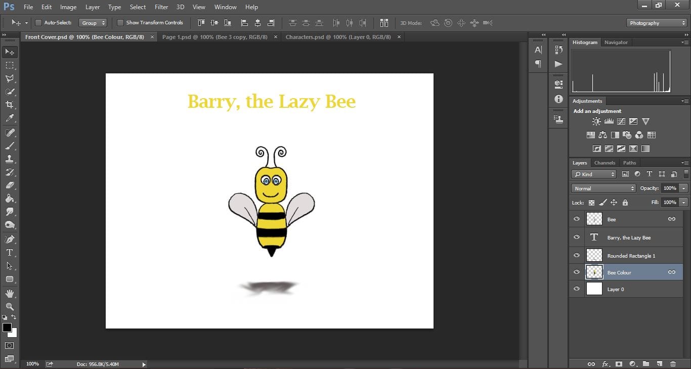
I wanted my title to be bigger, more obvious and more interesting, so I came up with this:

front cover update


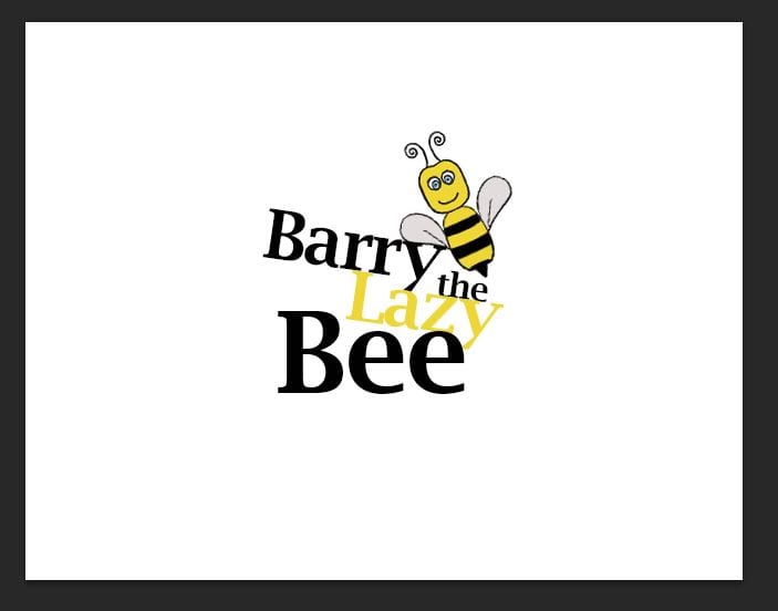
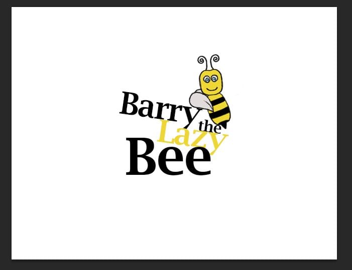
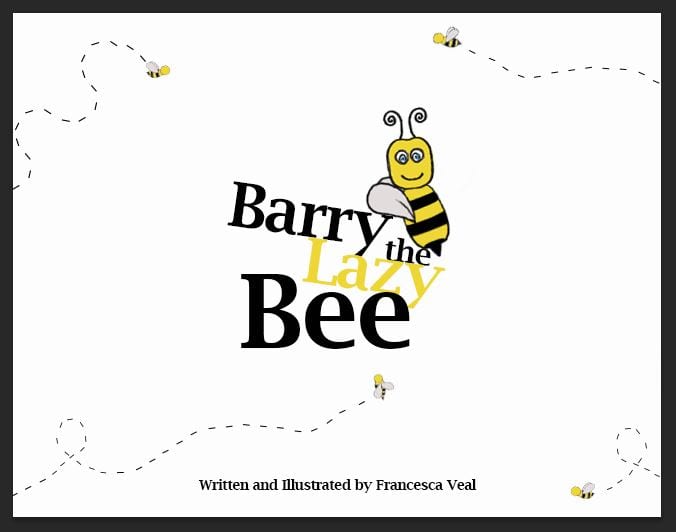
Much better! However I wanted it to appear so that the Bee was leaning on the text and that is why it is slanted, so I altered my little character a little.

front cover update 2


My next thought was adding colour so I experimented with a few:

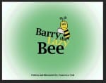
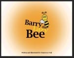
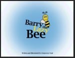
My favourite was the blue colour, however I still wasn’t thrilled with the design but I had hit a block and couldn’t think of any genius ideas. I decided to move on to my back cover whilst I think.

back cov

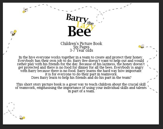
My back cover design came straight to me and I loved it. Not what I had planned in my storyboard but much better. The small details of the bees does not take the distraction away from the synopsis in the centre.

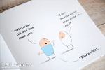
I then decided the small bees could be a theme and run on my front and back cover, which ultimately will be adding detail to my front cover and not look like too much.

font cov


I think I still need to spend some time playing around with the angles and positions of the bees however this design is much better than my original.

Layout designs

Before I start my storyboard I did some research in some different ways some children’s picture books have laid out their text and images.

The design layout that most appealed to me was the Winnie the Pooh designs. I like these because the images are purposefully  created to look as if they have been hand drawn, with the text placed around the images in the blank spaces. By placing the text almost ‘wrapped around’ the image I think it closely links them together, reinforcing the warm, family-orientated, comforting appeal the Winnie the Pooh books aim to create. In my storyboard I will use the books as inspiration for my layout.

Business Card Design

I decided to create a business card for my branding package for Fitnesse.

My first stage in the design was researching existing gym business cards and the layouts. I used the four below as my inspiration and layout ideas for my own.

I began with the front design of my card and recreated the simplicity of the first image in the gallery above. I wanted to link the poster design in and used a simple statement “GO TO THE GYM” in the same font as on my posters and website. With a plain background this really makes a striking impression, enough for someone to pick it up and have a look at the back.

Front of business card.

I then began working on the back design of my business card. Incorporating the hexagon design featured on my website, I used the shape to separate the card into two sections; the left side with the iconic figure of the woman from the “You put the I in Fitnesse” slogan and a list of the gyms facilities, and the right side is more informative on how to get in touch with the gym and their social media pages. I also added the 5 coloured hexagons from the top right corner of my website design onto the business card as well to keep the hexagon design a main part of the branding.

Back of my business card.

I used my main darker colours from my colour swatch for the card, but keeping with a plain white background so I could include a large amount of infomation without it looking too over crowded.

All I have left to do is to add my card onto a mock-up to display it in a more professional way.

Website Development #2

Today I have been working on my website development. Compared to my last post it has changed a lot! I wanted to keep the hexagon format to be part of the layout as I think it looks interesting to look at as well as being a unique way to click onto another page, rather than having the standard bar with tabs along the top of the screen.

2. WEBSITE blog update

This shows what the hexagons would look like once hovered over by a mouse. Obviously not all at once, but this image shows what each hexagon would say, and the page it would link too.

My colour scheme I have chosen blue, turquoise and greens as I feel the neutral colours add a relaxed approach to the gym, rather than the hard tough approach most gyms go for. However I want to conduct more research into what these colours connote, and create a colour swatch of the exact colours I am using.

Website Research

Searching the internet I found a ladies only gym, and captured some key aspects of the design layout and branding.

“GO30” is the gym advertised in the website below. The four slides are the first main part of the website, and it slides on a timer onto the next page showing different opportunities the gym brings. I like this layout, however without having a gym to photograph for mine i think the idea wouldn’t work very well for this project brief.

The next aspect of the website as I looked at was the “About us” section with two areas:

The first is a description about the gym and its aims and objectives. The second aspect was a “5 steps to a better you” which were five aspects the gym offers to attract every type of woman, making the workout part of a easy routine to get into. This aspect I really liked and want to incorporate this idea into my own.