Front Cover Development

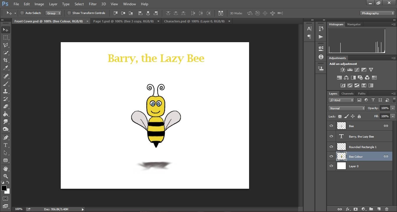
I have began working on my front cover, following my plan ideas in my storyboard.

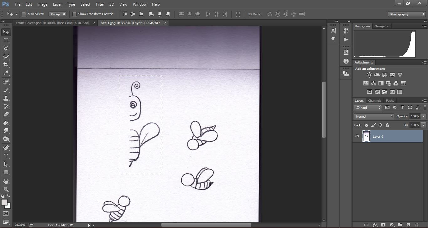
I began with my central image of my main character. I have chosen this bee sketch that i scanned in.

Front Cover Devel 1

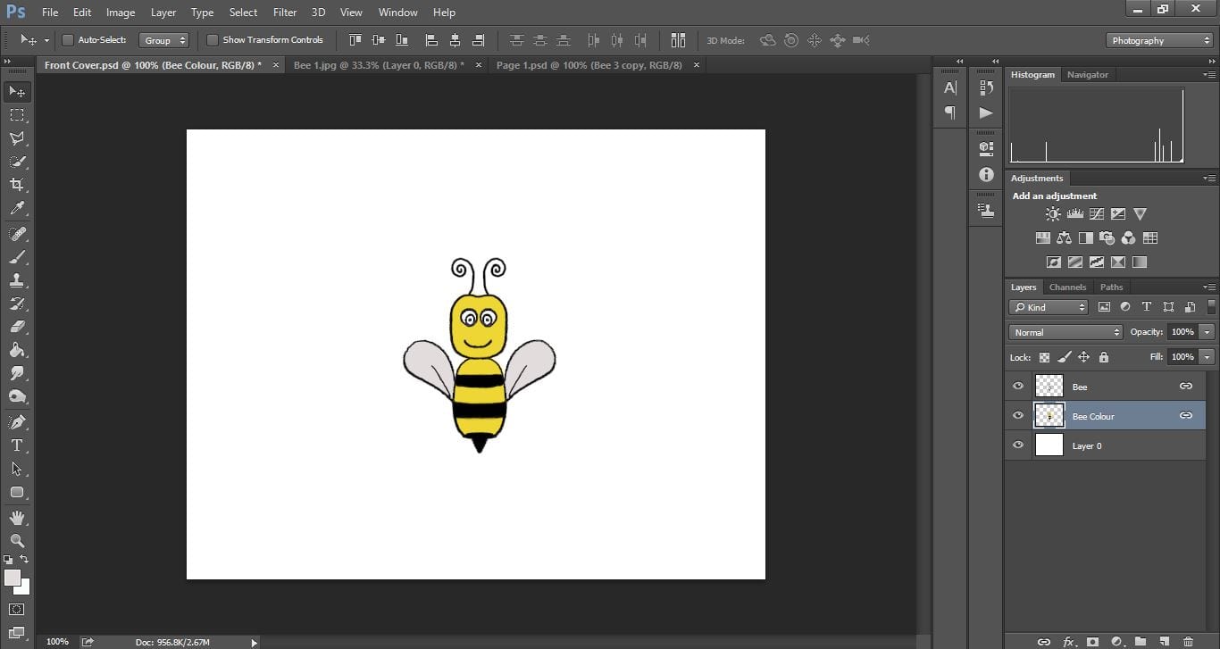
I removed the white from the background, duplicated the layer and flipped the layer horizontally to make the left side of the body.

Front Cover Devel 2

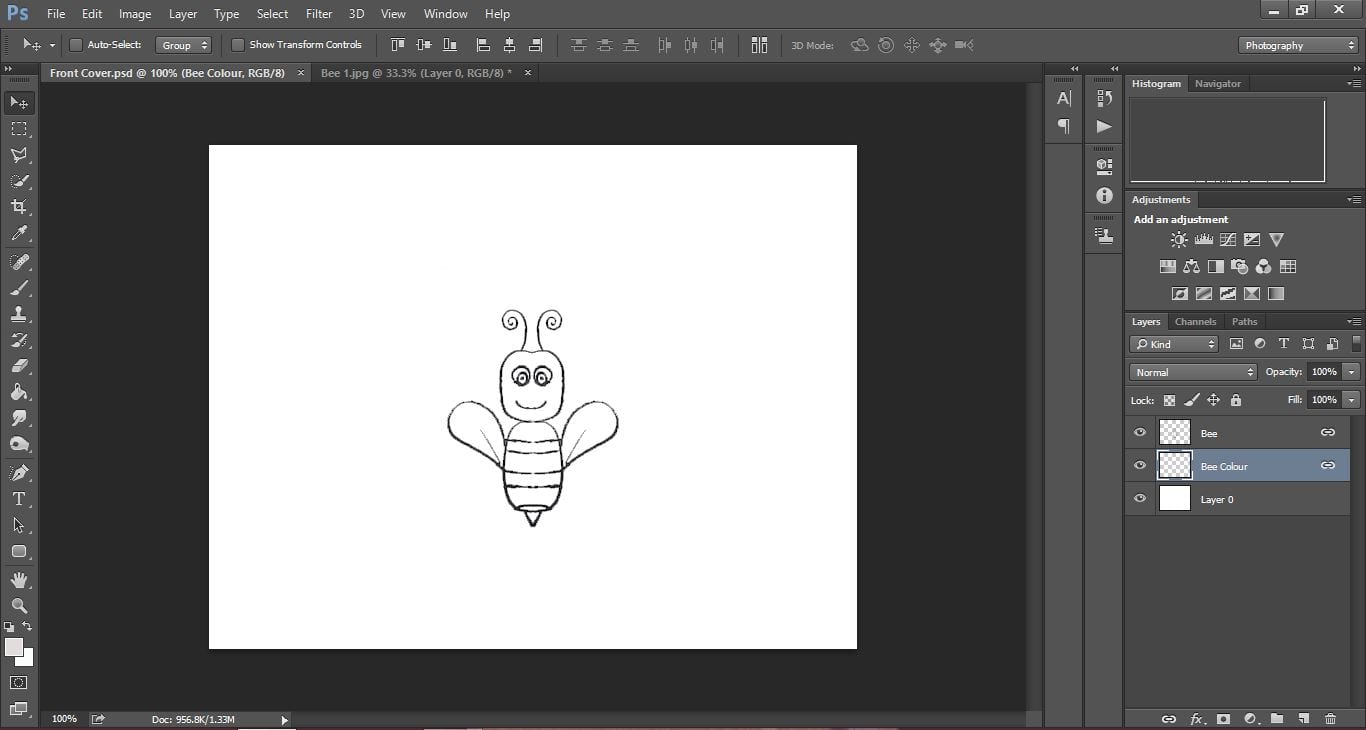
The outline needed a thin layer over the top to make it stand out more, and then I began colouring in the body on a layer underneath the outline – as shown in my workshop.

Front Cover Devel 3


I then placed in my title (temporary font and colour until I have decided on my type) and a shadow underneath the bee. I like the simplicity of my front cover at the moment and I think the plain white background is working better than a block colour, however I may add a faded background like I did for my first page but a green colour for the floor rather than blue for the sky.

Front Cover Devel 4

Website Development #2

Today I have been working on my website development. Compared to my last post it has changed a lot! I wanted to keep the hexagon format to be part of the layout as I think it looks interesting to look at as well as being a unique way to click onto another page, rather than having the standard bar with tabs along the top of the screen.

2. WEBSITE blog update

This shows what the hexagons would look like once hovered over by a mouse. Obviously not all at once, but this image shows what each hexagon would say, and the page it would link too.

My colour scheme I have chosen blue, turquoise and greens as I feel the neutral colours add a relaxed approach to the gym, rather than the hard tough approach most gyms go for. However I want to conduct more research into what these colours connote, and create a colour swatch of the exact colours I am using.

Logo and Slogan Development

I have been working on my logo and slogan designs in Photoshop and have been experimenting with different colours to see which works best.

LOGO IDEAS 2
 I can’t decide on whether to use the “F” or the silhouette of a woman for my main logo. I asked my design group and a member suggested using both; one for posters and business cards, and another for products and the website.In terms of colour, the second row seems to be the most popular/favourite among my design group.

After emailing my tutor I got the following feedback;

  • He agrees that both logos can be used in different scenarios; signage and larger adverts would work with extra details, and for smaller cards ( E.g. my business card) the “F” would work better.
  • The gap between the F and silhouette in the complete logo is awkwardly large and needs to be moved closer in.
  • Neat and tidy so far
  • Top three are favourites by colour, number one being top favourite


Website Development

I have begun working on my website development and layout, with an idea for the layout of the screen.

Using a hexagon shape they would be the links to other areas of the site, and as you hover over them the link to the page in which it will be taking you will pop up. As I am unsure with my colour palette yet I am experimenting with green and red so far.

WEBSITE DEVELOPMENT 1  WEBSITE VERSION 2 DEVELOPMENT 1