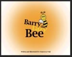
This is the first front cover I created, blocking out my title and main character positions.
I hated it.
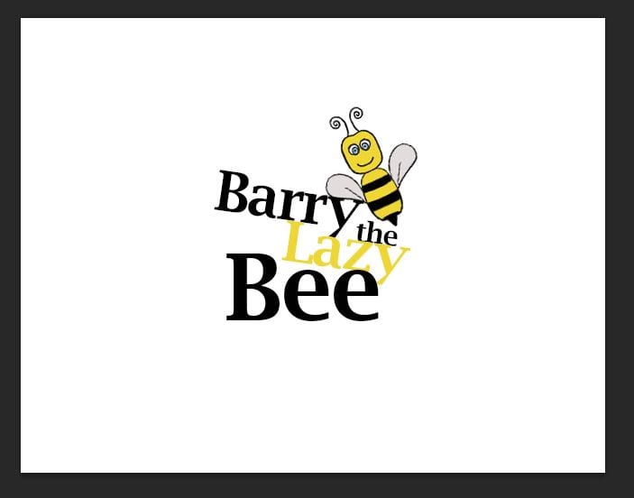
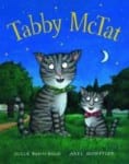
I wanted my title to be bigger, more obvious and more interesting, so I came up with this:
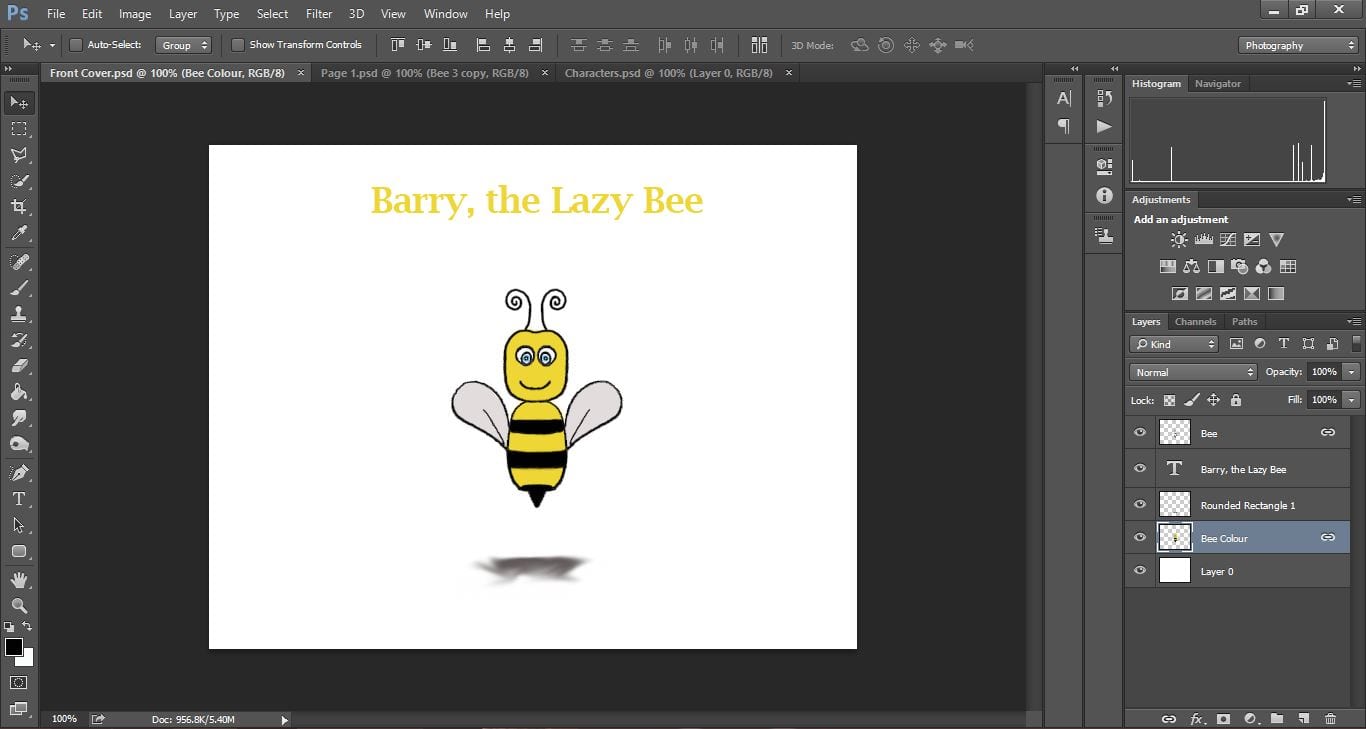
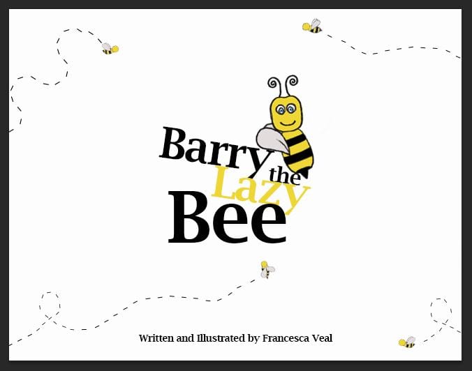
Much better! However I wanted it to appear so that the Bee was leaning on the text and that is why it is slanted, so I altered my little character a little.
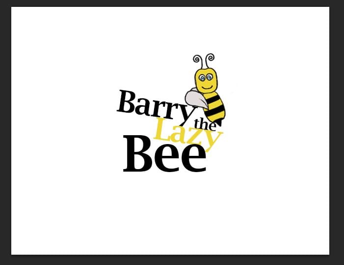
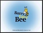
My next thought was adding colour so I experimented with a few:
My favourite was the blue colour, however I still wasn’t thrilled with the design but I had hit a block and couldn’t think of any genius ideas. I decided to move on to my back cover whilst I think.
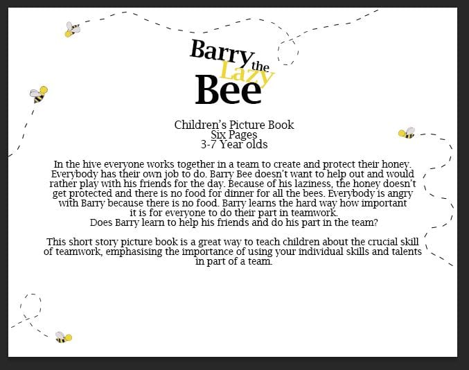
My back cover design came straight to me and I loved it. Not what I had planned in my storyboard but much better. The small details of the bees does not take the distraction away from the synopsis in the centre.
I then decided the small bees could be a theme and run on my front and back cover, which ultimately will be adding detail to my front cover and not look like too much.
I think I still need to spend some time playing around with the angles and positions of the bees however this design is much better than my original.
I want to use the skills I have learn from my other projects to help make this project the best I could.
Branding and Identity
In the creation of my picture book It is important that I consider how I make each design (colour, shape, technique) but I also need to think why I am making it that way and what influence it will have on my reader.
The choice of colour I use can connote a lot about my book – the mood of the characters, the moral of the story, feelings and emotions. Because I want my book to be happy and light feeling, not very dark or sinister, I want to stick to a certain set of colours which will create the mood I have envisioned. I therefore created a colour palette with swatches of the colours I will be using mostly.
My Colour Palette
By using these colours they will be branding my book, with the aim being that people will begin to connote these colours with the book. Also, by sticking to these it will neaten the book up and look more professional.
Considering Audience
I need to make sure my book is correctly targeting my chosen audience.
My specific audience is both male and female, aged 3-7. I have chosen aged 3-7 because aged 3-5 the Adults can read to their children, and aged 5-7 they can read the book themselves as the language is not too difficult.
I have researched into books targeted at that age range. The majority of them have cartoon animals as main characters which is lucky for me as I have already decided on bees. It is hard however to properly look at these books online as it only shows the front covers and not the inside of the books. However from what i have seen and noticed is that the designs are very simple – not over complicated – which I would guess it makes it easier for the children to understand and follow the storyline of the book.
Typography
When I think of children’s books four main books come to mind: Winnie The Pooh, The Tiger who came to tea, The Tale of Peter Rabbit and Tabby McCat.
The aspect all these classic children’s books have in common is their use of a serif thin font. If I had more time for this project I would have loved to have created my own font for the book as it would be more of my own work, however as I have said I don’t have enough time. When playing around with my front cover and the title I have taken a strong liking to the font Lucida Bright Demibold.
“Lucida Bright Demibold” used on my title
I think this font is easy to read and has a classic “hard-book” look to it, like the ones above.
Storyline
Although I have already written my story and storyline I found a useful website called “Writing Children’s Books for Dummies” and it gave useful tips about creating your storyline.
This has given me almost “feedback” to look at my own storyline and see if it is suitable and will target/attract/appeal to my audience.
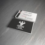
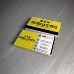
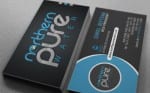
I decided to create a business card for my branding package for Fitnesse.
My first stage in the design was researching existing gym business cards and the layouts. I used the four below as my inspiration and layout ideas for my own.
I began with the front design of my card and recreated the simplicity of the first image in the gallery above. I wanted to link the poster design in and used a simple statement “GO TO THE GYM” in the same font as on my posters and website. With a plain background this really makes a striking impression, enough for someone to pick it up and have a look at the back.
Front of business card.
I then began working on the back design of my business card. Incorporating the hexagon design featured on my website, I used the shape to separate the card into two sections; the left side with the iconic figure of the woman from the “You put the I in Fitnesse” slogan and a list of the gyms facilities, and the right side is more informative on how to get in touch with the gym and their social media pages. I also added the 5 coloured hexagons from the top right corner of my website design onto the business card as well to keep the hexagon design a main part of the branding.
Back of my business card.
I used my main darker colours from my colour swatch for the card, but keeping with a plain white background so I could include a large amount of infomation without it looking too over crowded.
All I have left to do is to add my card onto a mock-up to display it in a more professional way.
Working on branding my colour scheme I have altered the colours of my advertisement posters to pull and link all the designs to one identity.
Version One
Version Two
Version One
Version Two
Version One
Version Two
Version One
Version Two
My only worry with this is that the colours won’t attract as much attention as my bright pinks and yellows, however the colours I’ve changed them to are iconic of the brand and therefore people will automatically think of the brand Fitnessé even without seeing the small “F” logo.
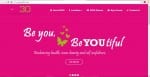
Searching the internet I found a ladies only gym, and captured some key aspects of the design layout and branding.
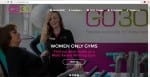
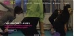
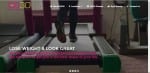
“GO30” is the gym advertised in the website below. The four slides are the first main part of the website, and it slides on a timer onto the next page showing different opportunities the gym brings. I like this layout, however without having a gym to photograph for mine i think the idea wouldn’t work very well for this project brief.
Slide One
Slide Two
Slide Three
Slide Four
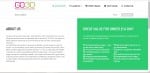
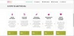
The next aspect of the website as I looked at was the “About us” section with two areas:
The first is a description about the gym and its aims and objectives. The second aspect was a “5 steps to a better you” which were five aspects the gym offers to attract every type of woman, making the workout part of a easy routine to get into. This aspect I really liked and want to incorporate this idea into my own.


