I decided to create a business card for my branding package for Fitnesse.
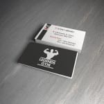
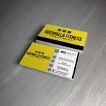
My first stage in the design was researching existing gym business cards and the layouts. I used the four below as my inspiration and layout ideas for my own.

I began with the front design of my card and recreated the simplicity of the first image in the gallery above. I wanted to link the poster design in and used a simple statement “GO TO THE GYM” in the same font as on my posters and website. With a plain background this really makes a striking impression, enough for someone to pick it up and have a look at the back.

I then began working on the back design of my business card. Incorporating the hexagon design featured on my website, I used the shape to separate the card into two sections; the left side with the iconic figure of the woman from the “You put the I in Fitnesse” slogan and a list of the gyms facilities, and the right side is more informative on how to get in touch with the gym and their social media pages. I also added the 5 coloured hexagons from the top right corner of my website design onto the business card as well to keep the hexagon design a main part of the branding.

I used my main darker colours from my colour swatch for the card, but keeping with a plain white background so I could include a large amount of infomation without it looking too over crowded.
All I have left to do is to add my card onto a mock-up to display it in a more professional way.