Logo Designs and Slogan Design:
![]()
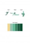
Colour Palette of Six Swatches:
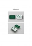
Business Card:


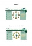
Website:
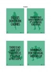
Posters:
Logo Designs and Slogan Design:
![]()
Colour Palette of Six Swatches:
Business Card:
Website:
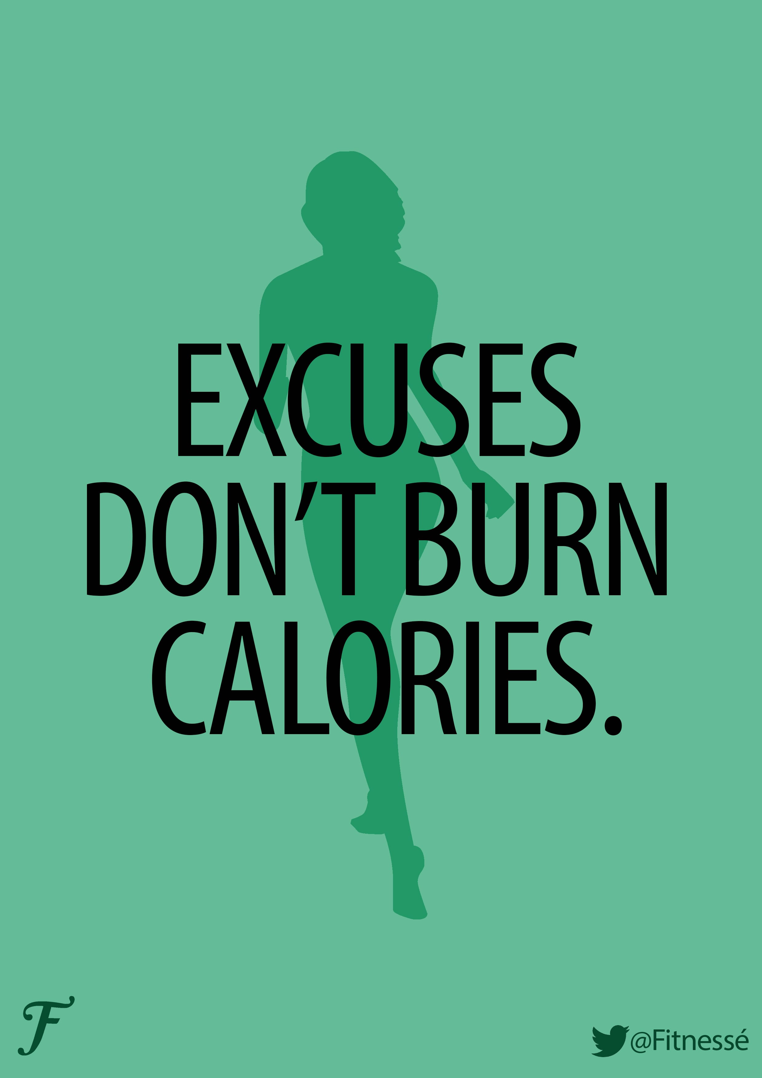
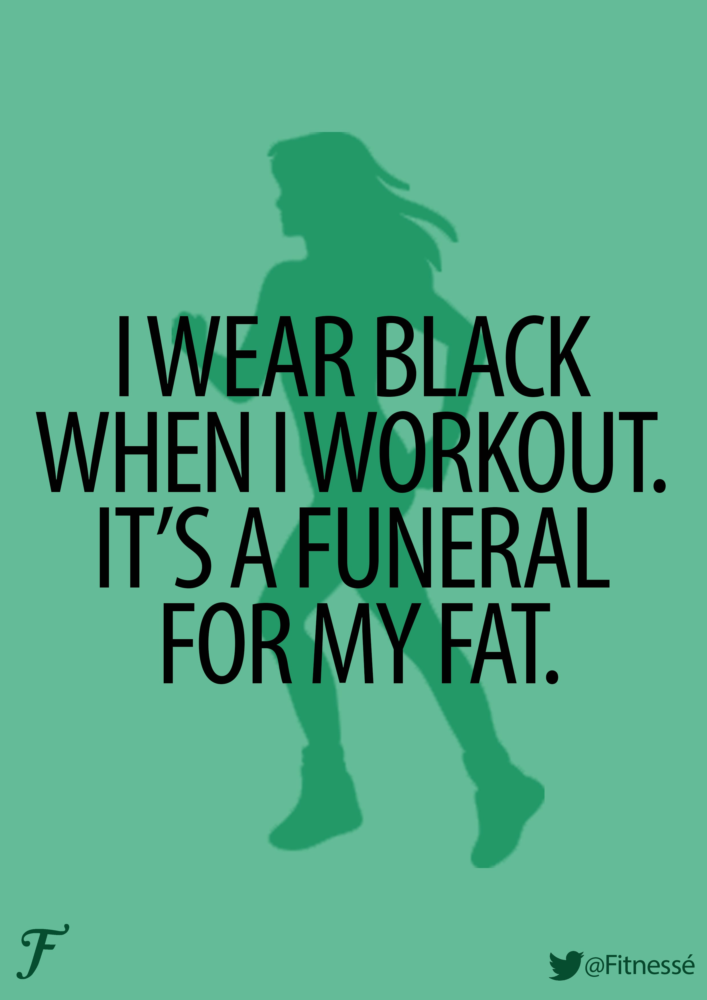
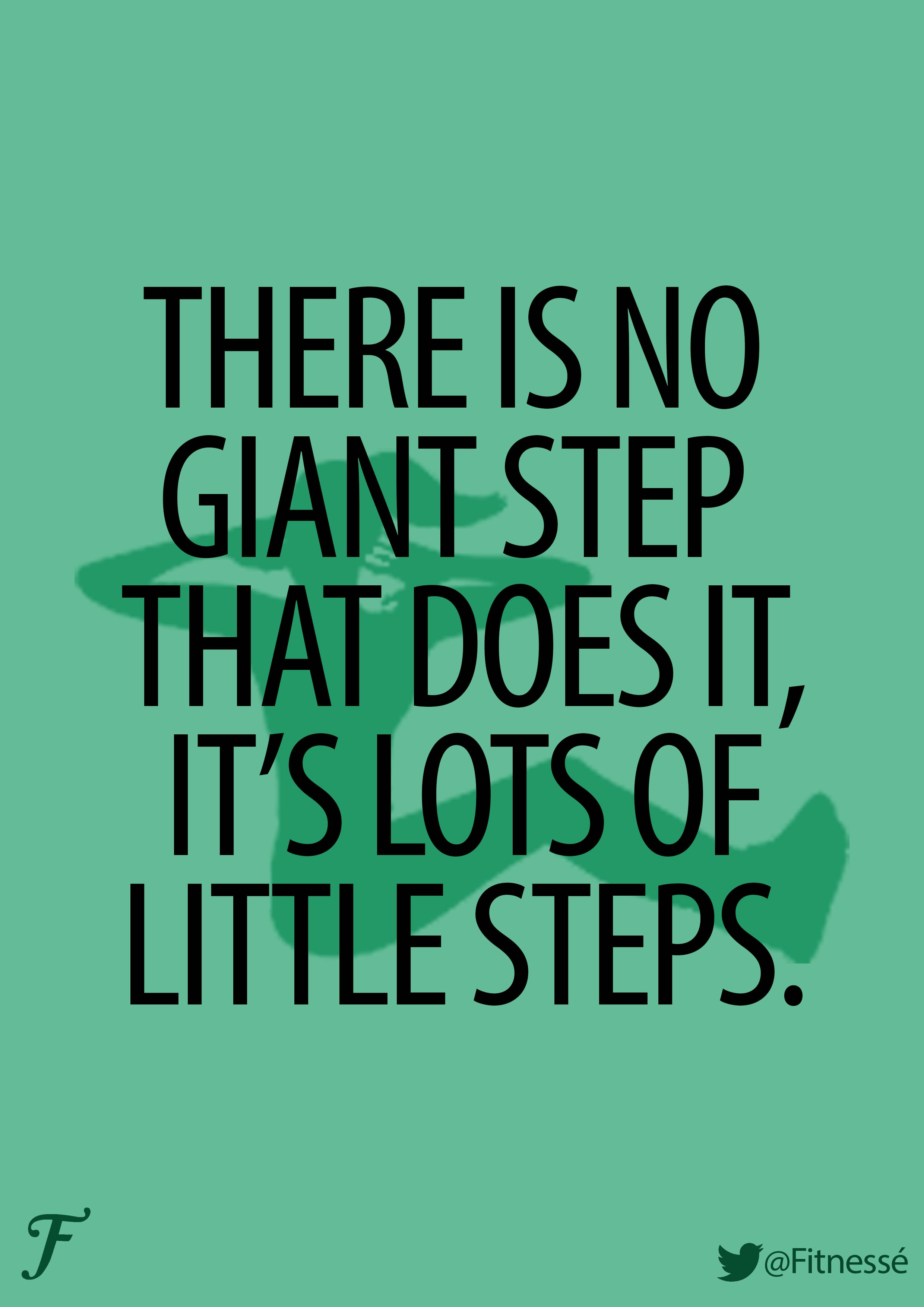
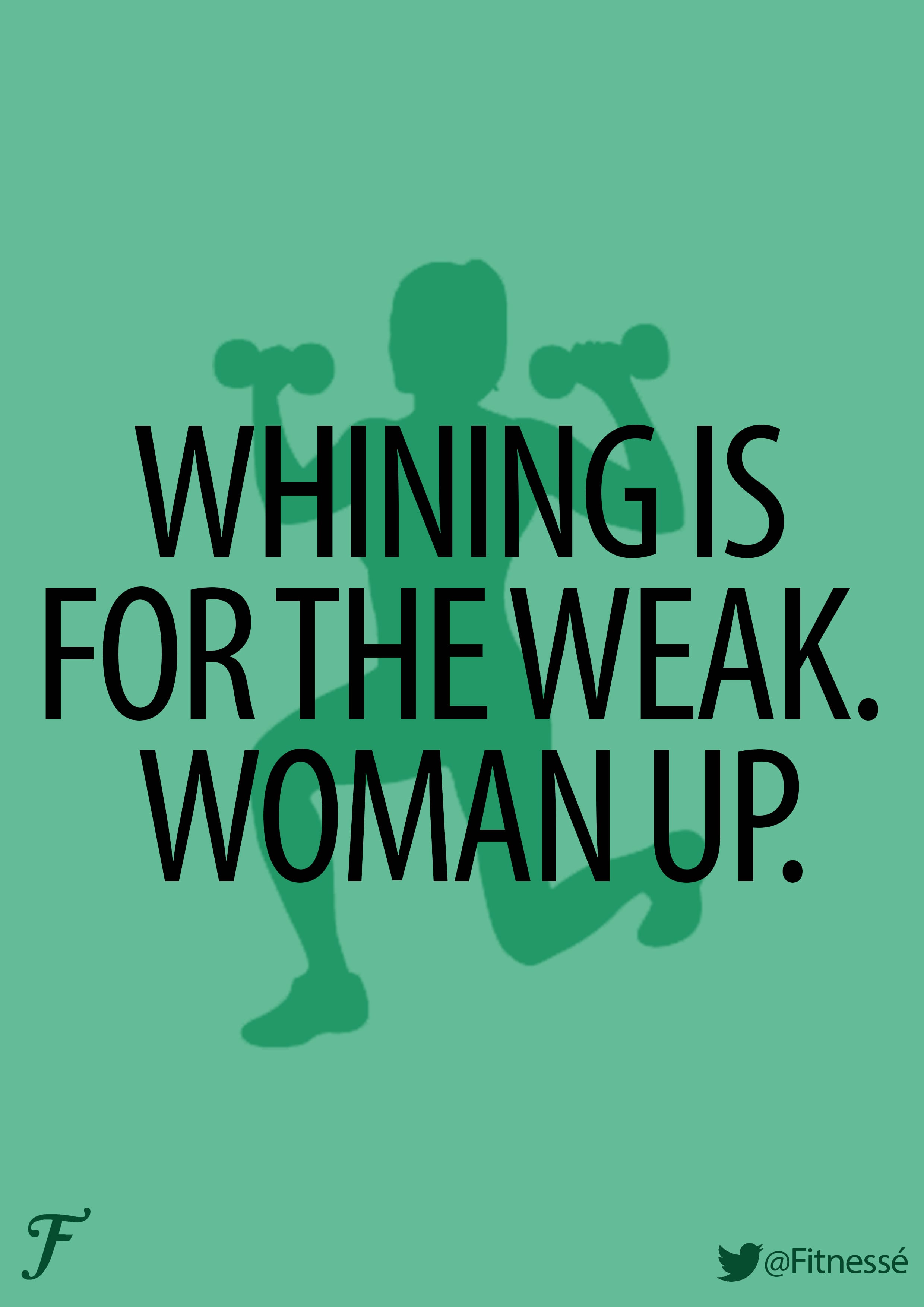
Posters:
Since receiving the feedback from my tutor and group in week five’s workshop, I have worked on amending the areas that needed changing in order to fit the brief and tidy my work up.
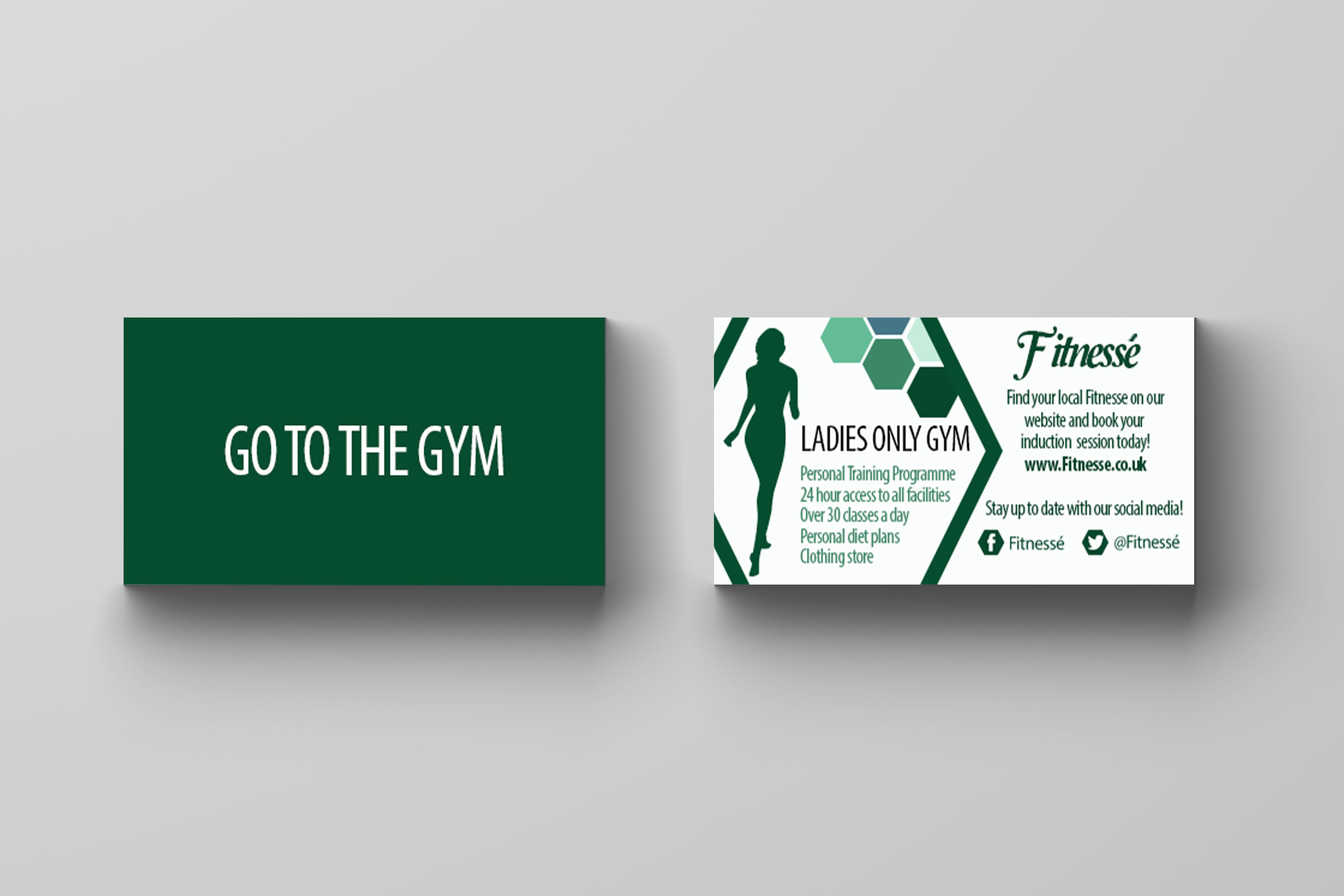
I removed some text from my Business Card to make the card look less ‘full’ and ‘busy’, and remodelled it on my mock-ups.

This tiny adjustment does clean the card up, ensuring its professionalism.
I also worked on the font of my posters. Again, a very simple adjustment of spacing out the letters slightly so the text is more readable and therefore will be more likely to achieve its goals by attracting people.
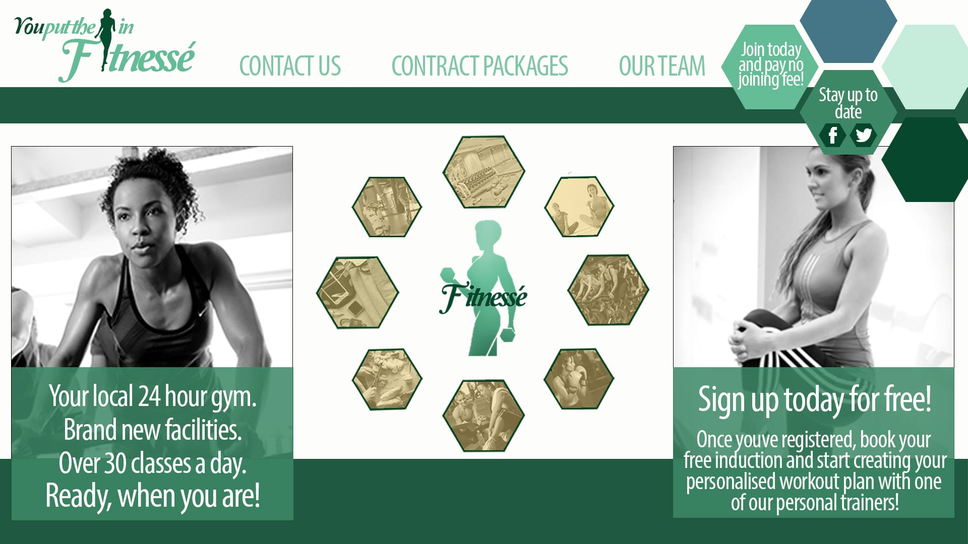
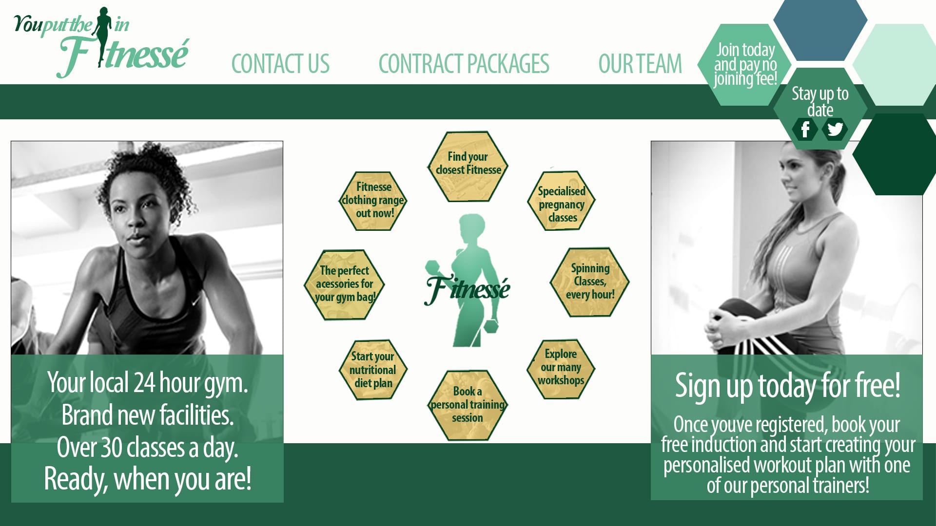
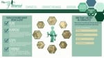
The most constructive criticism I received was about my website. It mostly circulated around the fact had no actual photographs of women in the gym, and therefore the realism that this was a website for a gym was not quite there and looked tacky and unprofessional. I therefore removed a large amount of work from the right and left side, keeping my central hexagon navigational icons, and added in photographs I had found online. I do very much prefer my new website, as the simplicity is enough to make the site look attractive enough.
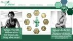
Week five’s workshop we sat as a group and looked through everyone’s ‘final’ designs. I presented the PDF document below, including my logos and slogans, colour palette, business card presented as a mock-up, two versions of my website and the four posters.
The Feedback I got from my group and tutor:
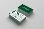
I decided to create a business card for my branding package for Fitnesse.
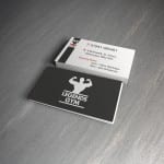
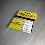
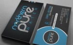
My first stage in the design was researching existing gym business cards and the layouts. I used the four below as my inspiration and layout ideas for my own.

I began with the front design of my card and recreated the simplicity of the first image in the gallery above. I wanted to link the poster design in and used a simple statement “GO TO THE GYM” in the same font as on my posters and website. With a plain background this really makes a striking impression, enough for someone to pick it up and have a look at the back.

I then began working on the back design of my business card. Incorporating the hexagon design featured on my website, I used the shape to separate the card into two sections; the left side with the iconic figure of the woman from the “You put the I in Fitnesse” slogan and a list of the gyms facilities, and the right side is more informative on how to get in touch with the gym and their social media pages. I also added the 5 coloured hexagons from the top right corner of my website design onto the business card as well to keep the hexagon design a main part of the branding.

I used my main darker colours from my colour swatch for the card, but keeping with a plain white background so I could include a large amount of infomation without it looking too over crowded.
All I have left to do is to add my card onto a mock-up to display it in a more professional way.
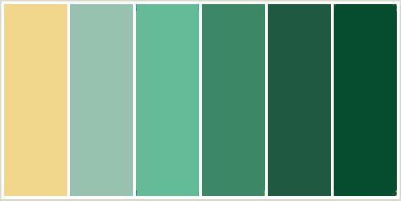
Though out this project I have found deciding on a colour palette which will work the best for my target audience a very challenging aspect. Being a female only gym i wanted to avoid the stereotypical feminine colours such as pinks and purples, however without these it was difficult to make it obvious the brand was for females.
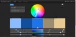


However I have decided, after gathering feedback from design students on my course, friends at home and my workshop tutor, I have created a colour swatch which includes all six colours I will be using in my package identity.

COLOUR REPRESENTATIONS/MEANINGS:
Blue shades connote health, tranquillity and water. White connotes hygiene, cleanliness and goodness. Green shades are associated with nature and growth.
These representations combined will implicate that this gym is a relaxing and positive place for women to work out comfortably.