Storyline and Synopsis

I have been working on developing my storyline and synopsis so I can begin with my planning and storyboarding.

Here is the PDF version which is easier to read: Storyline and Synopsis

Storyline and Synopsis

I have decided on a storyline, and split the lines into the six pages I will have in my book.

I used the website WritingForChildrenAndTeens.com for help on writing my synopsis.

I sent this document to my tutor to get feedback, to make any final amendments before I start creating my storyboard.

Reflection and Progress from Feedback

Since receiving the feedback from my tutor and group in week five’s workshop, I have worked on amending the areas that needed changing in order to fit the brief and tidy my work up.

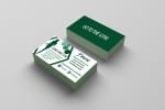
I removed some text from my Business Card to make the card look less ‘full’ and ‘busy’, and remodelled it on my mock-ups.

This tiny adjustment does clean the card up, ensuring its professionalism.

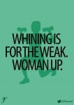
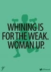
I also worked on the font of my posters. Again, a very simple adjustment of spacing out the letters slightly so the text is more readable and therefore will be more likely to achieve its goals by attracting people.

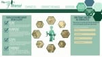
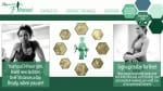
The most constructive criticism I received was about my website. It mostly circulated around the fact  had no actual photographs of women in the gym, and therefore the realism that this was a website for a gym was not quite there and looked tacky and unprofessional. I therefore removed a large amount of work from the right and left side, keeping my central hexagon navigational icons, and added in photographs I had found online. I do very much prefer my new website, as the simplicity is enough to make the site look attractive enough.


Week 11 Feedback Workshop

So I showed Mike and the group my work and found the feedback very positive and useful;

  • Re-create the comet on the timeline (they’re right, it does look rubbish)
  • The text is quite small and would be hard to read on a mobile device – maybe make it possible for the screen to zoom in and out?
  • The colour scheme is good and does represent a historic appeal
  • The idea behind the project is good and original
  • Cartoon Einstein and cartoon characters at the top of the screen add a good factor to the design.

Feedback Reflection

In our workshop this week I had a little catch up with Mike and discussed my typography work so far. The main two outputs of the conversation was;

  • Whilst the phrase “Beautiful CHAOS” was good, I should mainly focus on the word ‘beautiful’ to be my final piece. (This I did agree on as whilst the word ‘chaos’ resembled what it was,I found it less interesting than ‘beautiful’)
  • “Beautiful” needed something extra to be added to stand out more. ( i.e. another tight material to be wrapped round that was thicker and also had some colour too it. And also some kind of plaque or frame to present the work on/in.)

In response to this feedback I have already begun work on my type. I have bought a thick pink ball of wool which I have began wrapping around my letters tightly. I am already finding my work more visually appealing and the colour and texture of the wool is definitely emphasising  each letters structure and format.
IMG_2603

I also wanted to work on presenting my text better. I went out to B&Q and purchased a slab of MDF wood which I then painted white. By nailing the type onto the wood it should hopefully give it a more 3D look and the contrast in colours will emphasise the shape of the letters.