I have created a rough storyboard on Photoshop to give me a rough idea of the layout of my book, page sizes, organisation and storyline.
Here is a PDF version: Storyboard
I can now begin editing my images and creating each page.
I have created a rough storyboard on Photoshop to give me a rough idea of the layout of my book, page sizes, organisation and storyline.
Here is a PDF version: Storyboard
I can now begin editing my images and creating each page.
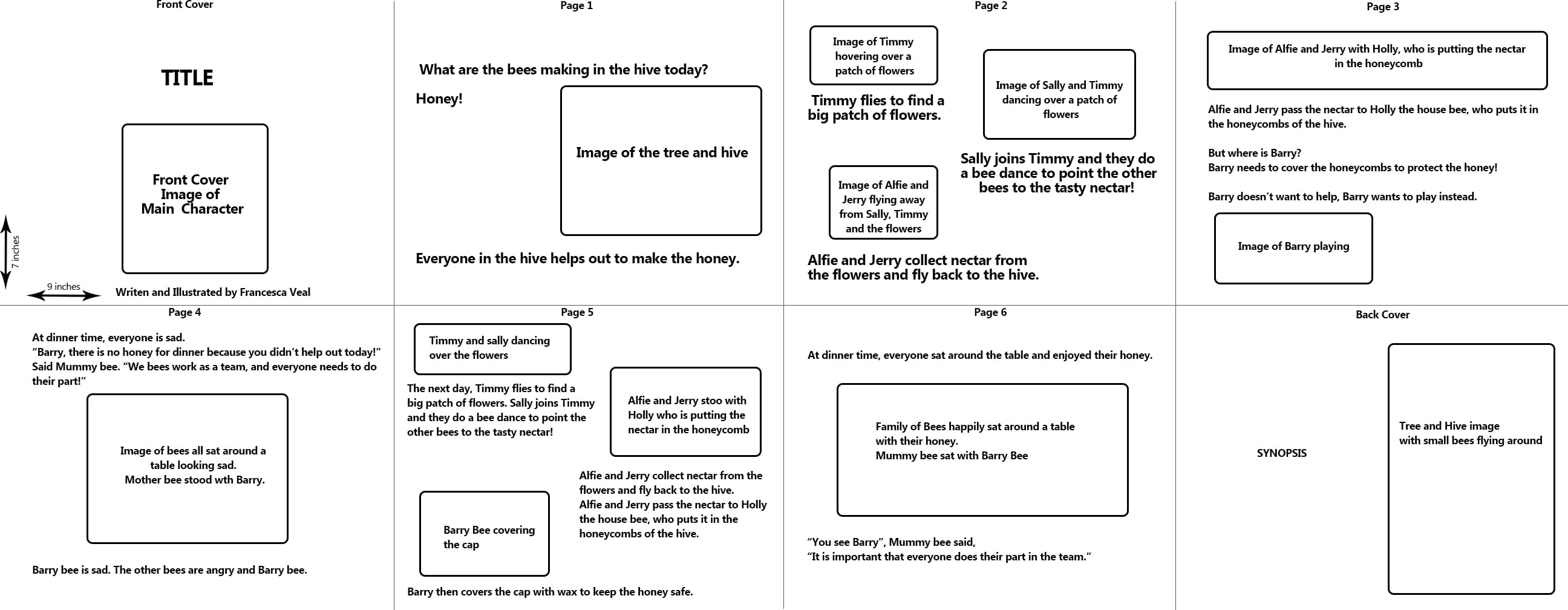
I have been working on developing my storyline and synopsis so I can begin with my planning and storyboarding.
Here is the PDF version which is easier to read: Storyline and Synopsis

I have decided on a storyline, and split the lines into the six pages I will have in my book.
I used the website WritingForChildrenAndTeens.com for help on writing my synopsis.
I sent this document to my tutor to get feedback, to make any final amendments before I start creating my storyboard.
Now I have my initial idea in my head; creating a sculpture of letters made out of a strong metallic material but with an aim to create elegance out of it by making a serif font; I can begin to research typographers who have tried to do similar things. My first port of call was to simply Google “typography sculptures” and an array of beautiful and interesting images were unravelling and I was clueless where to start. So I began with the ones I found most intriguing.
I discovered a website called Typostrate.com which is filled with articles on typography.

The one I particularly looked at was an article with images of type sculptures that artists have created. My favourite is the one in the image below;

The simplicity yet complication of the twists is so beautiful to look at and has made me think about twists I could create with my sculpture. The 3D aspect is something I want to incorporate into my work, and displayed on a wall for my final presentation of it as it shows the detail of the letters more clearly. The second aspect I have taken from this work is thinking about colours. I want to keep the metallic colour of the metal twists but also introduce another colour/item which represents the elegance of the font, perhaps a flower or wood and parts of a tree trunk with hidden green leaves in-between.
I have discovered my new favourite place to get Type inspiration from, The Chic Type Blog. It is a blog created by a graphic designer and type enthusiast which includes different categories of type which she researched from other graphic typography designers. I absolutely love her blog and found lots of work I want to use as a starting point for my own type.
I love the serif fonts that have large swashs’ creating that elegant and relaxing look, just like these examples she has on her blog:


I then found this work by Joseph Alessio called Tooling Around. He formed each letter of the alphabet out of metal materials, however I noticed they were all San Serif fonts. This made me wonder if i could create a typeface made out of a strong metalic material that looks tough, but create an elegance about it using swashs’ on my typeface like the above fonts.


