Poster Research and Planning

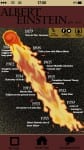
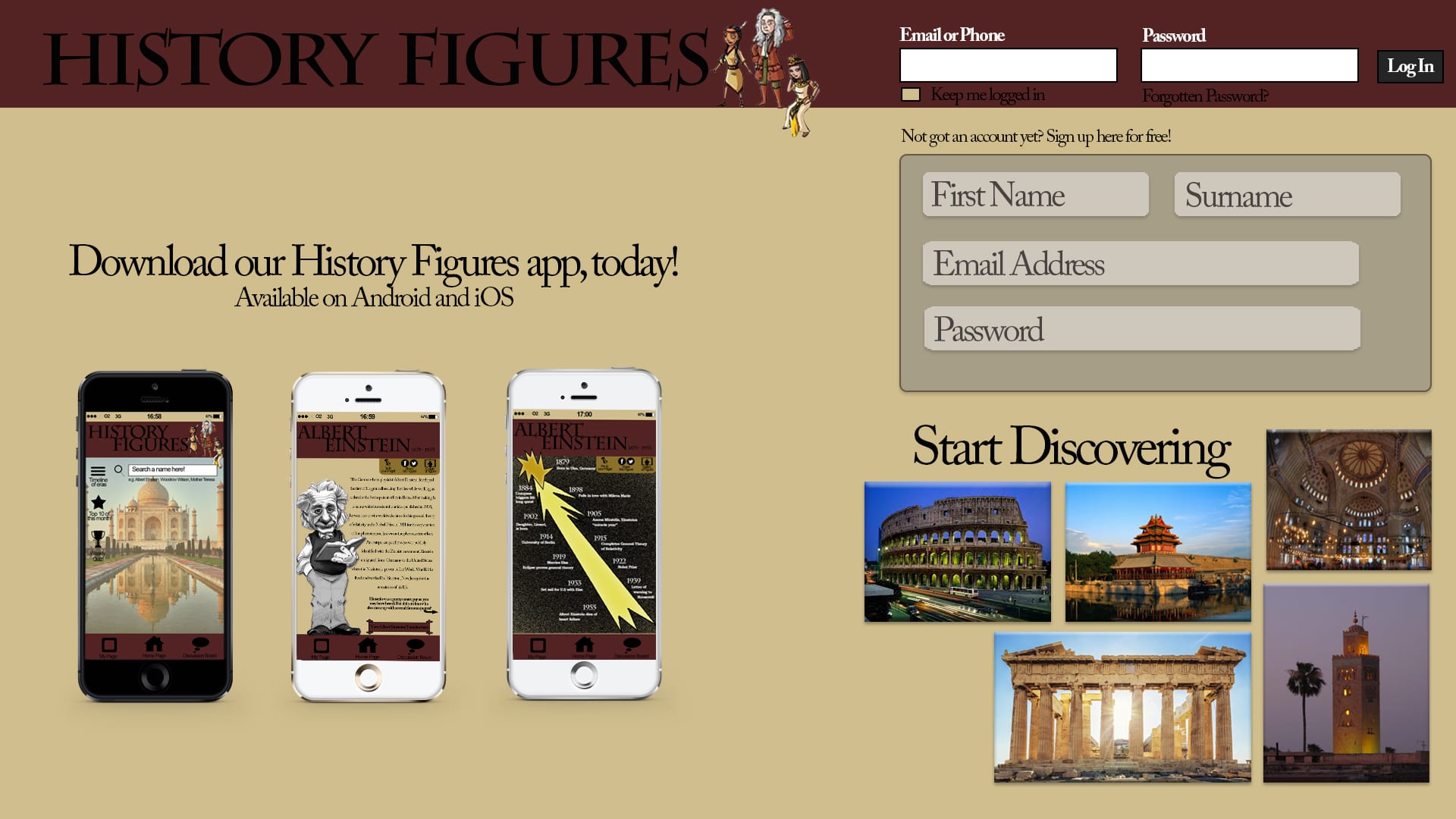
I wanted my poster to continue the History Figures brand and decided to use it as an advertisement poster for the website and app. I began by looking at what other website posters look like, as its not something you see very often as websites are usually advertised online.

The posters I saw were very text heavy, with lots of big objects and colours going on, and the majority of them featuring a screen with the website displayed. I picked a sample from the ones I was looking at;
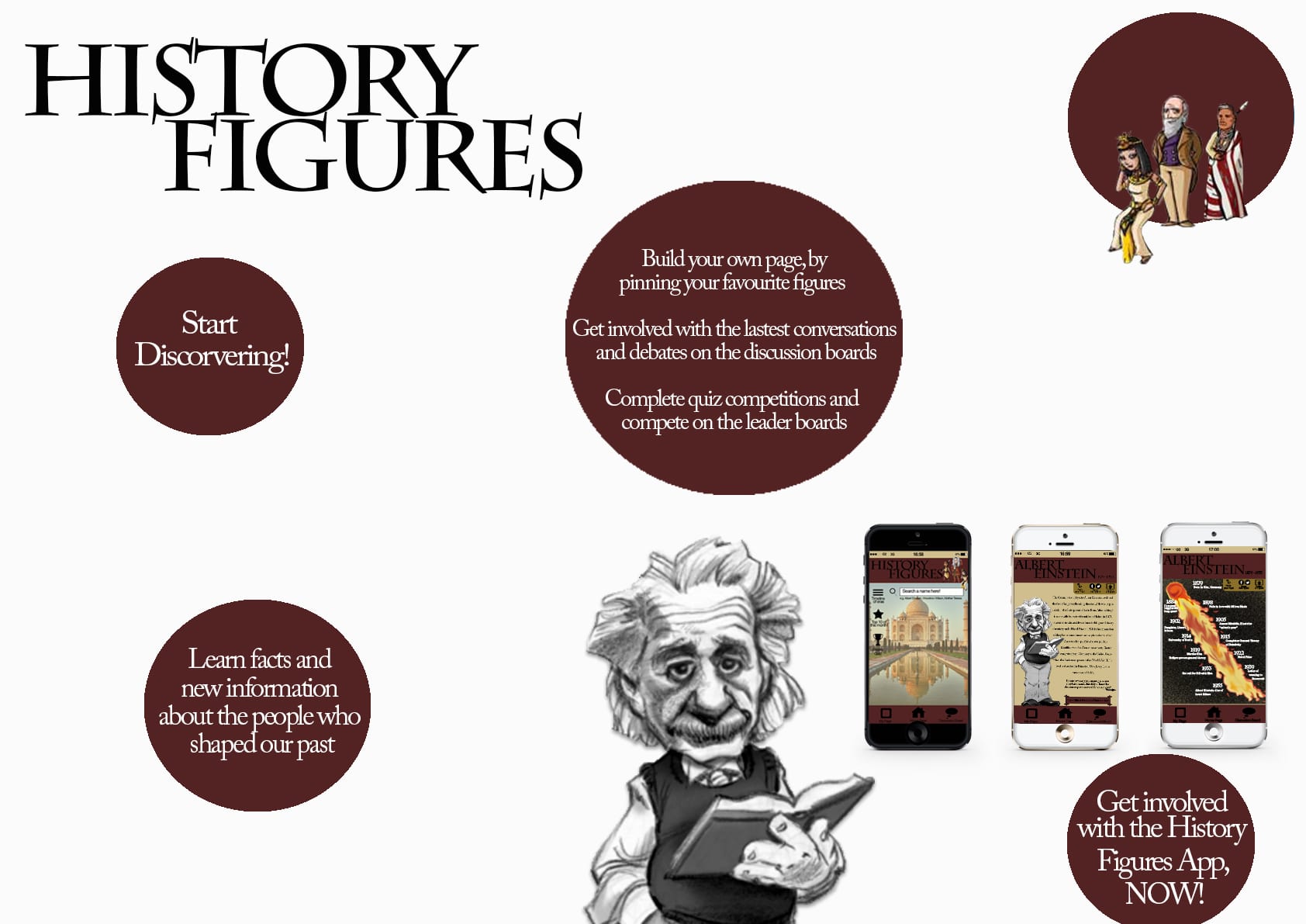
 PLANS

I want to steer away from these concepts and create a very minimalistic poster. I am thinking of creating a poster with a blank background, possibly white rather than the stone in my other pieces, with the ‘History Figures’ logo in the top corner. I want my information to be floating around the page inside objects, this way, the viewer will be steered to focus solely on the information. I will stick to my house colours of white, black, maroon and stone to keep the continuity of the brand going. The layout of the poster is definitely going to be different from my other two pieces, having a more ‘free’ and ‘floaty’ structure rather than a firm structure.


Week 11 Feedback Workshop

So I showed Mike and the group my work and found the feedback very positive and useful;

  • Re-create the comet on the timeline (they’re right, it does look rubbish)
  • The text is quite small and would be hard to read on a mobile device – maybe make it possible for the screen to zoom in and out?
  • The colour scheme is good and does represent a historic appeal
  • The idea behind the project is good and original
  • Cartoon Einstein and cartoon characters at the top of the screen add a good factor to the design.

Online desktop Research

I want to keep all my elements of this project linked with a strong brand and therefore my online desktop will be the website homepage for ‘History Figures’.

For the layout of my webpage, I want to stick to ‘simplicity’ as my main aim so my users can navigate the site easily. I spent some time looking at popular websites; Facebook, Instagram, Twitter and Cbbc sites.

I took inspiration from the Cbbc and Facebook sites, and created a top bar on my site, including the sites name and a log in area. I then used a PSD Mock-up and placed my app pages onto mobile devices to influence users to get involved using the app, similar to Instagram’s homepage. On the Cbbc site, I liked how they had sections stuck out and filled with an image. I incorporated this into my own webpage and had a ‘Start Discovering’ area displaying images that will be on the site once they log in.

Online Desktop