I wanted my poster to continue the History Figures brand and decided to use it as an advertisement poster for the website and app. I began by looking at what other website posters look like, as its not something you see very often as websites are usually advertised online.
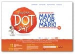
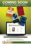
The posters I saw were very text heavy, with lots of big objects and colours going on, and the majority of them featuring a screen with the website displayed. I picked a sample from the ones I was looking at;
PLANS
I want to steer away from these concepts and create a very minimalistic poster. I am thinking of creating a poster with a blank background, possibly white rather than the stone in my other pieces, with the ‘History Figures’ logo in the top corner. I want my information to be floating around the page inside objects, this way, the viewer will be steered to focus solely on the information. I will stick to my house colours of white, black, maroon and stone to keep the continuity of the brand going. The layout of the poster is definitely going to be different from my other two pieces, having a more ‘free’ and ‘floaty’ structure rather than a firm structure.

