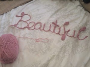
In our workshop this week I had a little catch up with Mike and discussed my typography work so far. The main two outputs of the conversation was;
- Whilst the phrase “Beautiful CHAOS” was good, I should mainly focus on the word ‘beautiful’ to be my final piece. (This I did agree on as whilst the word ‘chaos’ resembled what it was,I found it less interesting than ‘beautiful’)
- “Beautiful” needed something extra to be added to stand out more. ( i.e. another tight material to be wrapped round that was thicker and also had some colour too it. And also some kind of plaque or frame to present the work on/in.)
In response to this feedback I have already begun work on my type. I have bought a thick pink ball of wool which I have began wrapping around my letters tightly. I am already finding my work more visually appealing and the colour and texture of the wool is definitely emphasising each letters structure and format.

I also wanted to work on presenting my text better. I went out to B&Q and purchased a slab of MDF wood which I then painted white. By nailing the type onto the wood it should hopefully give it a more 3D look and the contrast in colours will emphasise the shape of the letters.

