I have began working on my front cover, following my plan ideas in my storyboard.
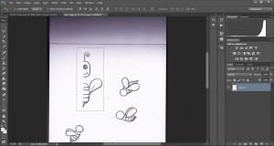
I began with my central image of my main character. I have chosen this bee sketch that i scanned in.
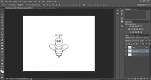
I removed the white from the background, duplicated the layer and flipped the layer horizontally to make the left side of the body.
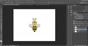
The outline needed a thin layer over the top to make it stand out more, and then I began colouring in the body on a layer underneath the outline – as shown in my workshop.
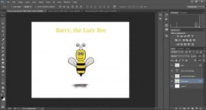
I then placed in my title (temporary font and colour until I have decided on my type) and a shadow underneath the bee. I like the simplicity of my front cover at the moment and I think the plain white background is working better than a block colour, however I may add a faded background like I did for my first page but a green colour for the floor rather than blue for the sky.


