I want to use the skills I have learn from my other projects to help make this project the best I could.
Branding and Identity
In the creation of my picture book It is important that I consider how I make each design (colour, shape, technique) but I also need to think why I am making it that way and what influence it will have on my reader.
The choice of colour I use can connote a lot about my book – the mood of the characters, the moral of the story, feelings and emotions. Because I want my book to be happy and light feeling, not very dark or sinister, I want to stick to a certain set of colours which will create the mood I have envisioned. I therefore created a colour palette with swatches of the colours I will be using mostly.
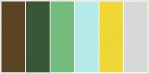
By using these colours they will be branding my book, with the aim being that people will begin to connote these colours with the book. Also, by sticking to these it will neaten the book up and look more professional.
Considering Audience
I need to make sure my book is correctly targeting my chosen audience.
My specific audience is both male and female, aged 3-7. I have chosen aged 3-7 because aged 3-5 the Adults can read to their children, and aged 5-7 they can read the book themselves as the language is not too difficult.
I have researched into books targeted at that age range. The majority of them have cartoon animals as main characters which is lucky for me as I have already decided on bees. It is hard however to properly look at these books online as it only shows the front covers and not the inside of the books. However from what i have seen and noticed is that the designs are very simple – not over complicated – which I would guess it makes it easier for the children to understand and follow the storyline of the book.
Typography
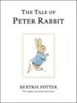
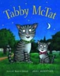
When I think of children’s books four main books come to mind: Winnie The Pooh, The Tiger who came to tea, The Tale of Peter Rabbit and Tabby McCat.
The aspect all these classic children’s books have in common is their use of a serif thin font. If I had more time for this project I would have loved to have created my own font for the book as it would be more of my own work, however as I have said I don’t have enough time. When playing around with my front cover and the title I have taken a strong liking to the font Lucida Bright Demibold.
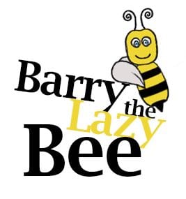
I think this font is easy to read and has a classic “hard-book” look to it, like the ones above.
Storyline
Although I have already written my story and storyline I found a useful website called “Writing Children’s Books for Dummies” and it gave useful tips about creating your storyline.
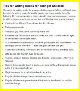 This has given me almost “feedback” to look at my own storyline and see if it is suitable and will target/attract/appeal to my audience.
