As I have come to the end of my project I have begun to reflect on the work I have produced, what I like about my designs and what I wish I could have improved/thought about more.
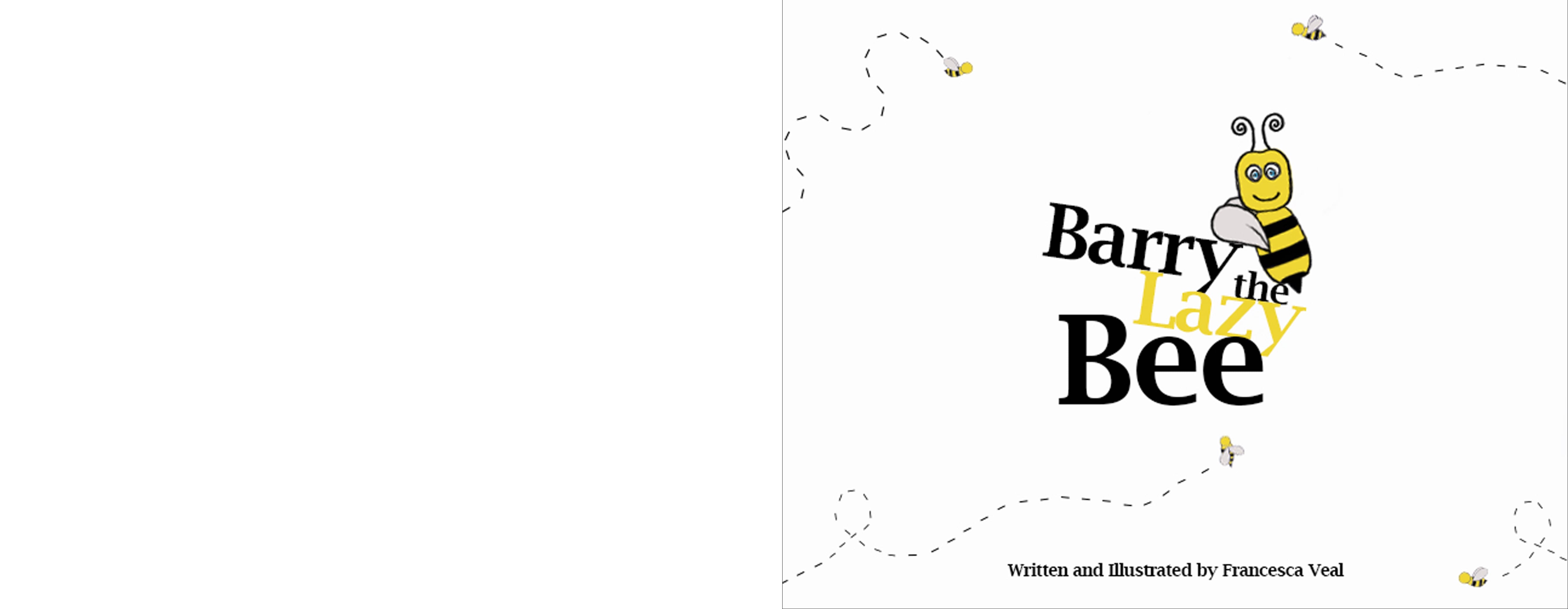
I think the book Is well designed to aim for my target demographic audience of three to seven year old’s, with the painted style of the designs, rough brush and pencil strokes and simple designs that are easy to follow.
One aspect I wish I could have worked harder on/spent more time researching and creating would be my font design of my book. The font does hold connotations of more “old, classic” children’s books such as The Peter Rabbit books and the old Winnie The Pooh books which was my intention. However, thinking back I wish I spent more time looking at more modern and contemporary picture books and the fonts they use. If I had more time I could have loved to have created my own font for the book, with a handwritten style.
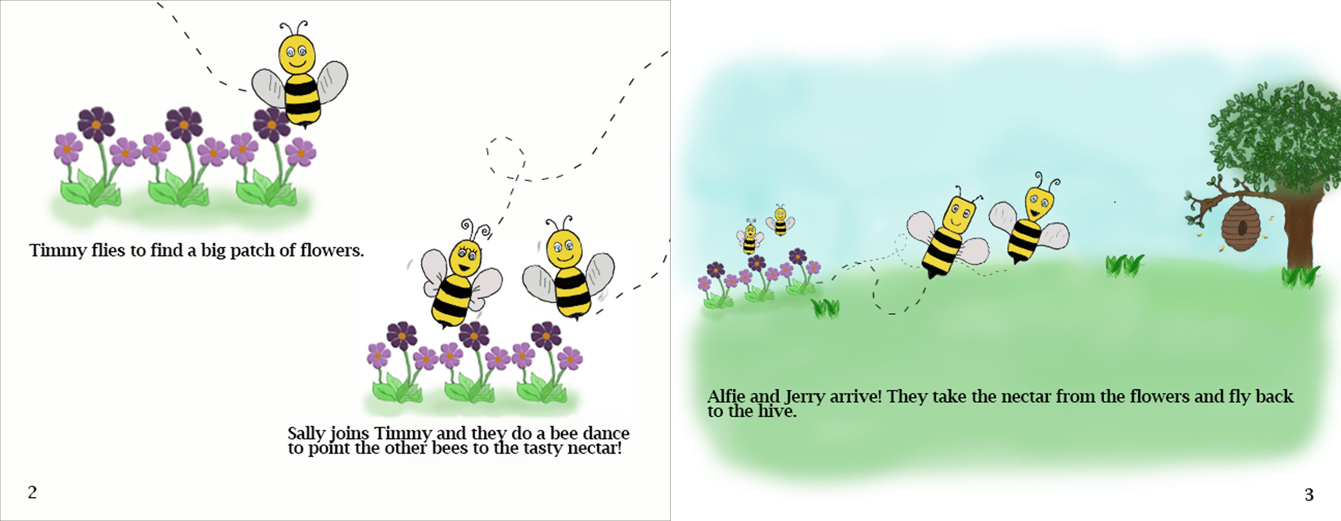
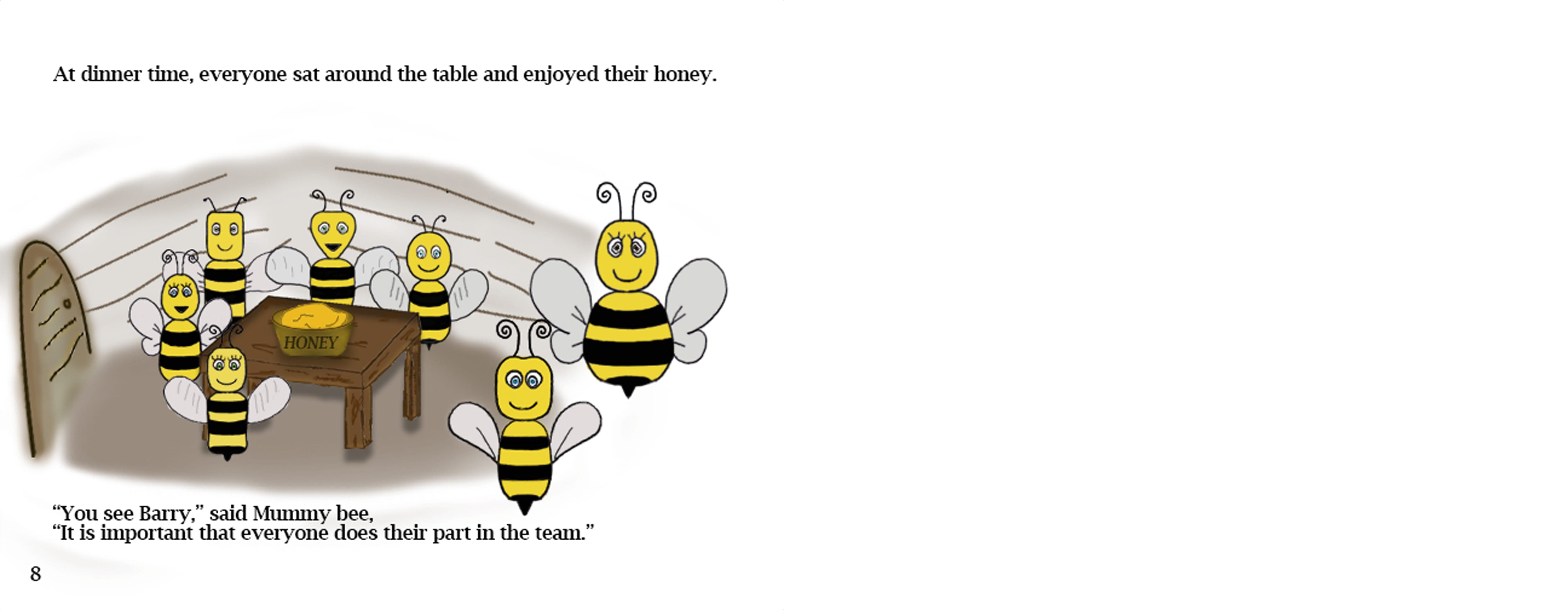
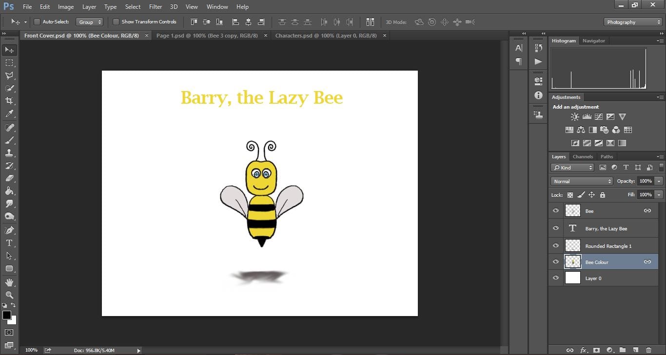
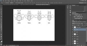
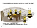
 I am glad when I designed my individual characters that I made sure each figure had a different aspect to their image to identify them. To specify which gender the characters were this was as easy as adding eyelashes onto the female bees which immediately made it obvious. I feel this will make it easier for my audience to follow the storyline with there being so many characters.
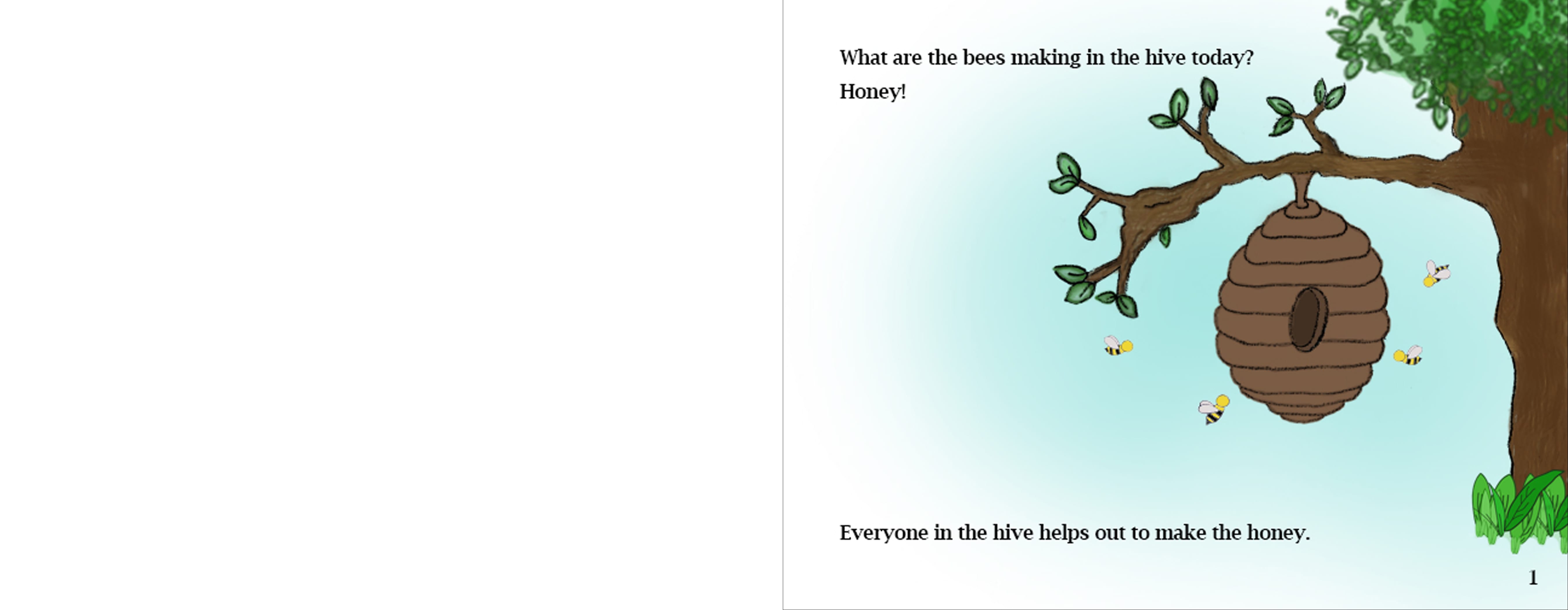
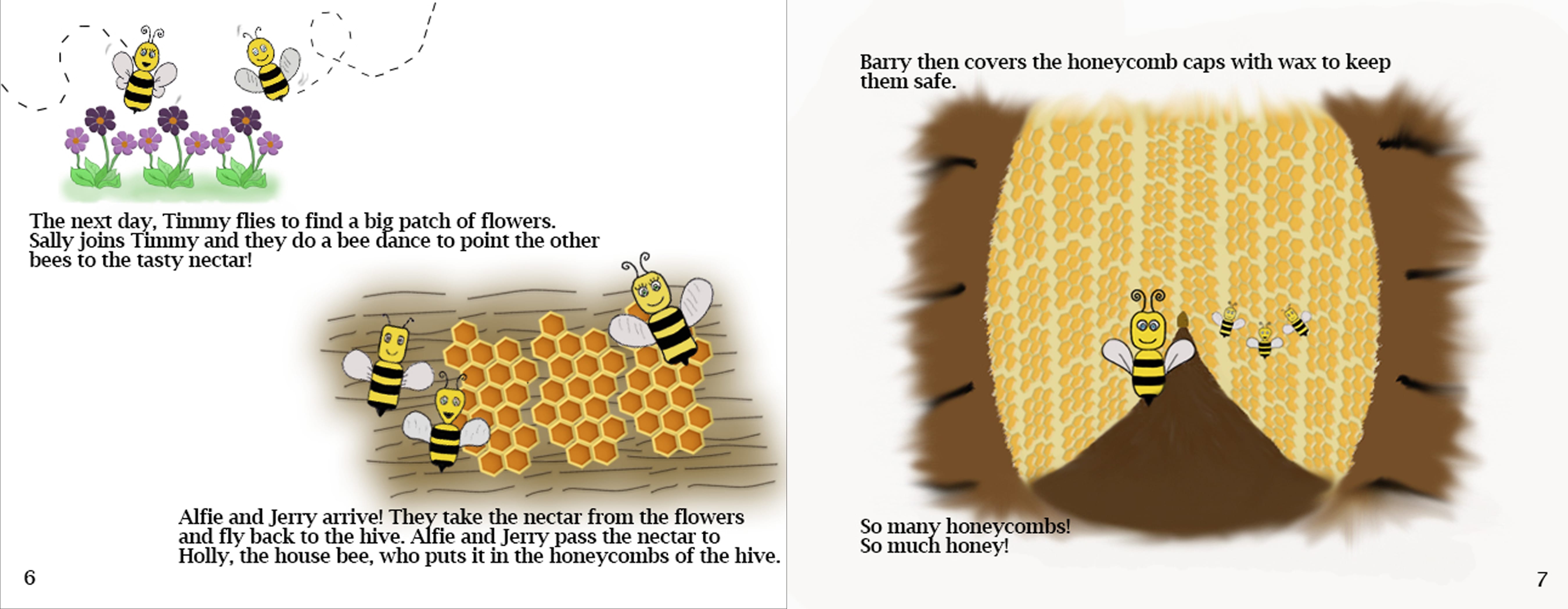
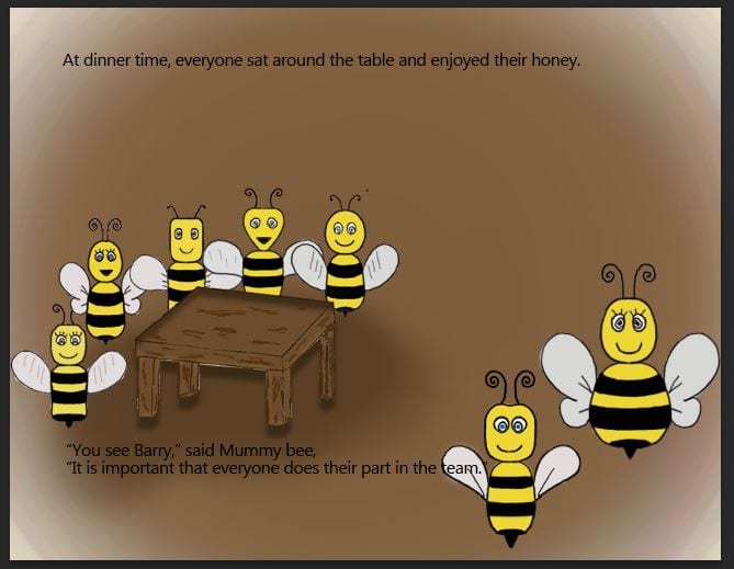
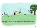
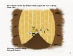
Another amendment I would have made if I could re-design the book, is having block colours as the background. I found it very hard to make it obvious the characters were in a scene but still have a white background. For example: Pages 3, 7 and 8 below, I tried to keep the background white to keep consistency of the design throughout. Therefore I used faded brush tools to create the background of the scene central of the page. Looking back, I wish I didn’t do this and used block colours for my background of each scene – I just found this hard to do with all the small items that needed to be seen in order for the storyline to make sense.
I am very glad I chose line painting to create my designs. I found it enjoyable to create my characters and images. To improve on these however I wish I researched more into how to create line paintings and watch YouTube tutorials, so I could learn some new skills and my work would look better. I am frustrated at myself that I did not do this because it was my intention to do this when I started the project, however I can only learn from my mistakes and I may practice my line painting and explore tutorials online in the future.
If I had finished my designs with enough time, I would have loved to have asked children, and parents with children to read my book and receive feedback on the designs and storyline of the book. Having feedback from my target demographic audience would have enabled me to have a look at my finished project and make any adjustments that could have made a big difference in appealing to my audience.
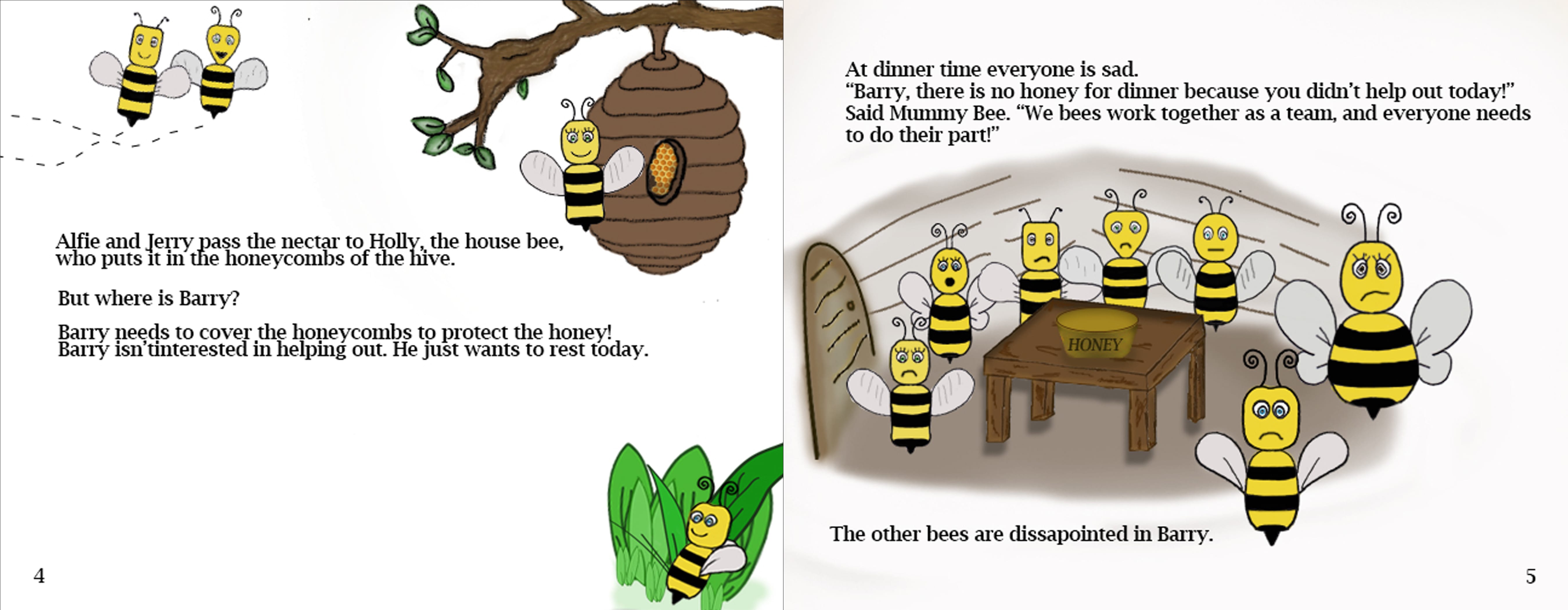
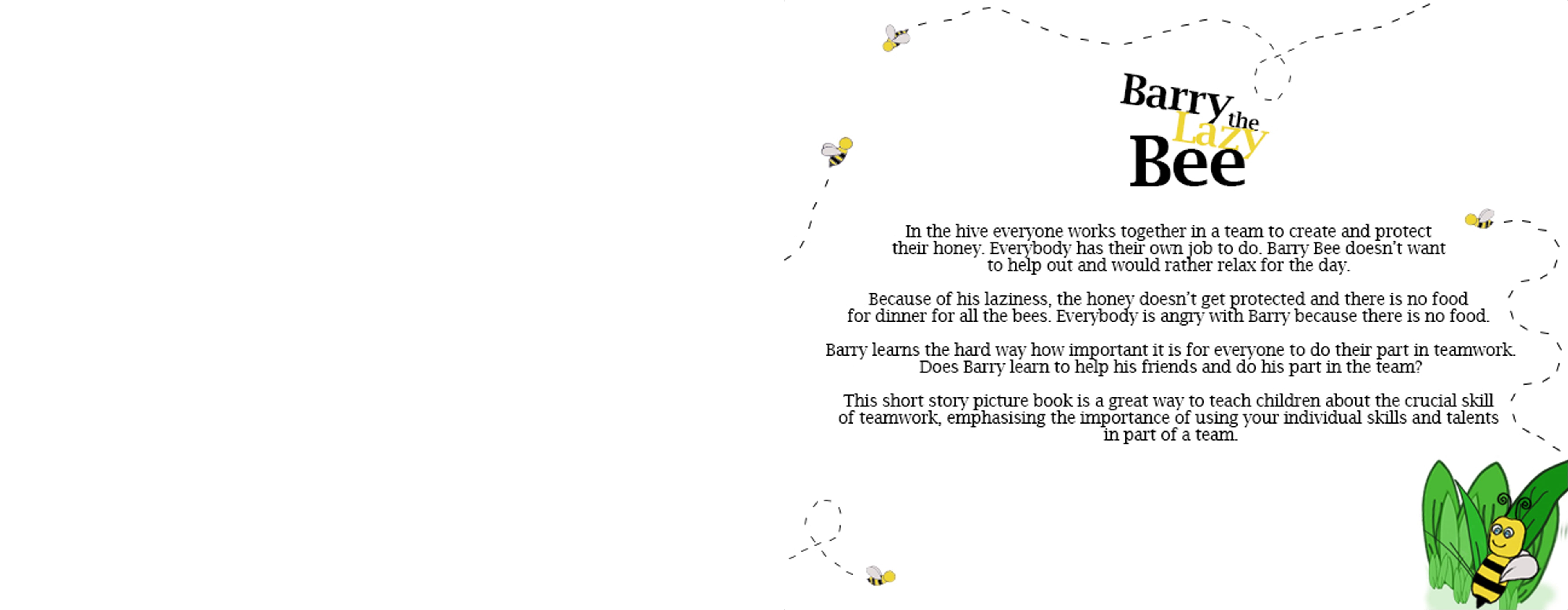
I hope my designs and storyline successfully get across the message of the book. I’m glad I chose the animal Bee to transfer this message has the Bee are known and hold connotations of teamwork and hard work, which will hopefully help get my message across – that individual skills and talents are very important but they are most important when working in part of a team, and it is crucial that all team members work together.