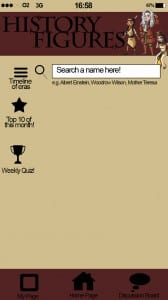
I started by creating the ‘home page’ for my app. I used the apps on my own phone for inspiration and imitated the layout. I created the signal circles, digital clock and battery along the top to make the app look more realistic for a mobile.
 The title “History Figures” is written in ‘Charlemagne Std Bold’ as the spikey serifs with the clean lines looks like a late twentieth century font which links to the historical factor of the app.
My choice in colours, stone, maroon and black, I feel connote an ‘old, history’ appeal, effective most when minimally used.
The cartoon characters of Pocahontas, Issac Newton and Cleopatra add an appealing factor for a possible younger audience. I got this idea from watching the children’s TV show ‘Horrible Histories’.
After feedback and advise on what to fill my homepage with, I have decided to fill the middle with pictures of historical landmarks which, when the app is functioning, will automatically fade into another random picture on a cycle of roughly 20 pictures. Below are three prototypes of what they would look like;


