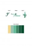
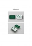
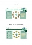
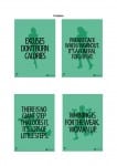
Week five’s workshop we sat as a group and looked through everyone’s ‘final’ designs. I presented the PDF document below, including my logos and slogans, colour palette, business card presented as a mock-up, two versions of my website and the four posters.
The Feedback I got from my group and tutor:
- Business Card: It may need some text taking out so it doesn’t look so busy and ‘full’.
- Good colour palette and use of colours throughout the package.
- They liked the hexagon design used throughout.
- Posters: Unsure on the font – maybe needs spacing out slightly.
- The branding may need some actual photographs to make it look more realistic
- Themes going through: powerful, clean, energetic, strong women
- Possibly make the woman in the slogan more slanted – try italics?


