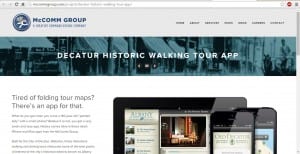
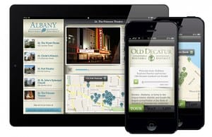
Whilst slowly developing my ideas for my website and app, I found an example of an app and website which incorporates a history element, something I was interested in doing.
The site appears to be very modern, using metallic colours of silver and blue to represent this. The structure and layout is one in which I hope mine will look as professional as, and I will try to do this by using features from this. (such as, a banner across the top, the main section being a mock-up one side and text the other, an image banner with text inside.)
The layout of the app looks very easy to access and manoeuvre around, and using a font for the text that looks from the 19th century which fits in well with the objectives and aims of this app. The colours again are metallic and bland, and I hopefully want to avoid this by using a more vibrant colour but still representing the theme of my app.

