Infographics – What are they, and how are they used successfully?
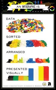
“Information graphics or infographics are graphic visual representations of information, data or knowledge intended to present information quickly and clearly. They can improve cognition by utilizing graphics to enhance the human visual system’s ability to see patterns and trends.” -(https://en.wikipedia.org/wiki/Infographic)
I searched for examples of infographics, designed for different audiences/purposes so I can start to get an idea of what audience I want to target for the project. I came across the website loveinfographics.com and found the following infographics;
1) “The Ultimate Bachelor Party Survival Guide”
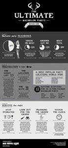 What I have taken from this infographic:
- Sticking to three colours is a good way to go about it – sections can be emphasised by a certain colour but by having more than two it makes it more appealing to look at.
- Sectioning the infographic is a good structure: It could be designed as a ‘step-by-step’ guide or split into different points to make the information more clear
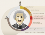
2) “Foods that make you smarter”
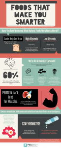 What I have taken from this infographic:
- Again, it sticks to a minimal 3 colours
- There is almost an even mixture of text and images – it isn’t too packed full of text which makes the infographic look clearer to read
- I have began to learn that a lot of infographics are in long rectangular strips, starting at the top and going through to the bottom
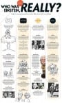
3) “It Pays To Hope” – (http://abduzeedo.com/cool-infographic-designs)
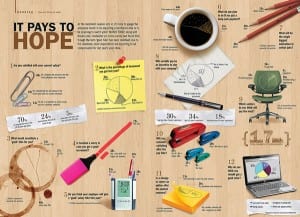 What I like from this infographic:
- I like how the images are photographs and placed in three columns to technically very organised, however they have a ‘scattered’ look.
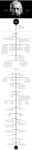
4) Timeline of Video Games – (http://abduzeedo.com/cool-infographic-designs)
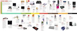 What I liked about this infographic:
- The simplicity of it – its a timeline with images, literally.