Page One Development

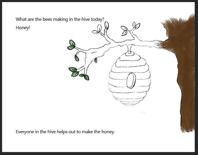
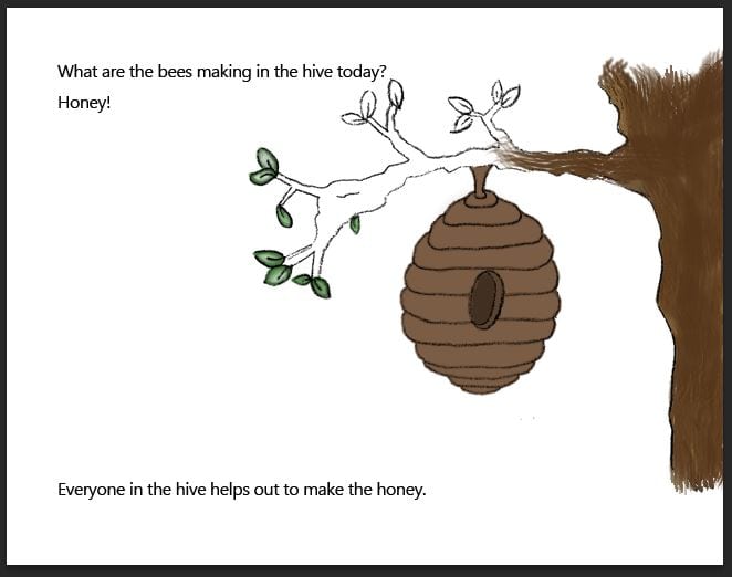
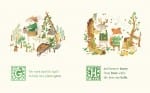
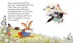
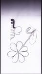
I have been using what I was taught in my design workshop on line painting to colour in my objects for my first page.

blog update2

blog update

blog update3

blog update4


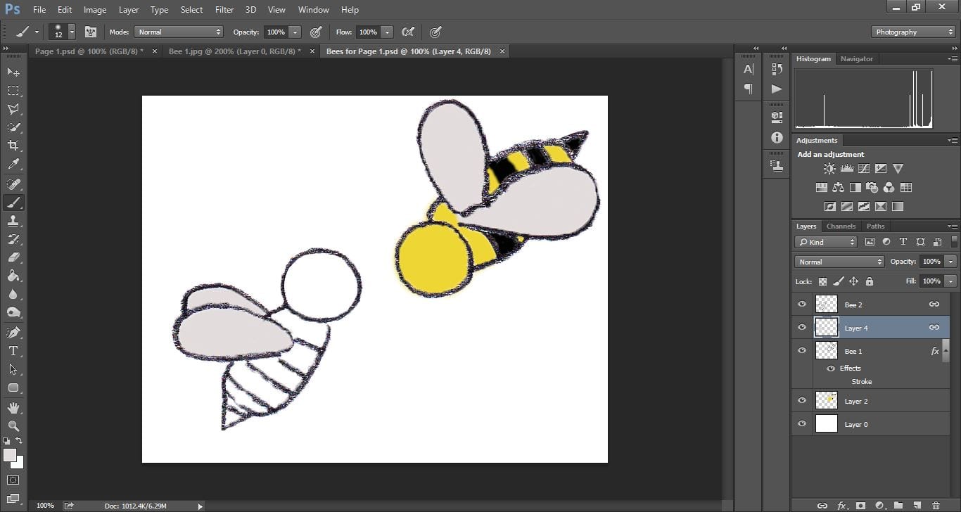
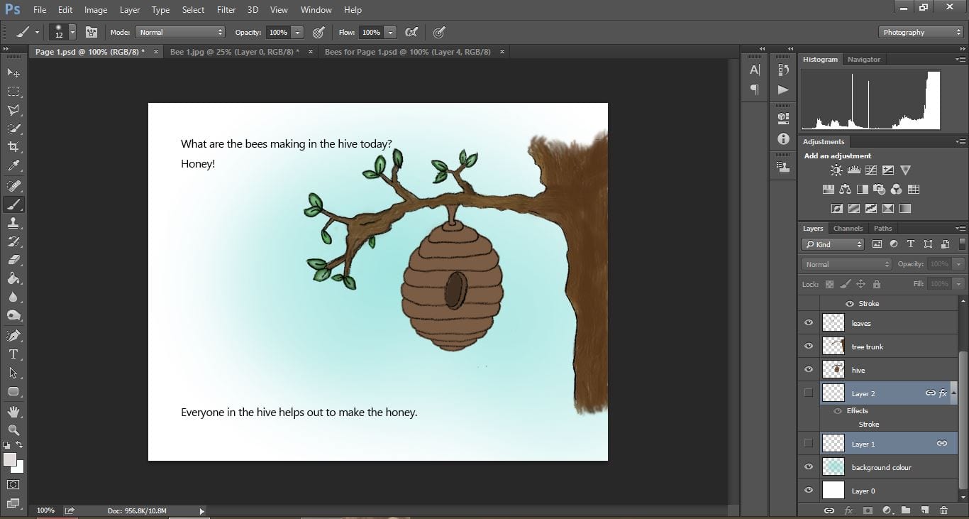
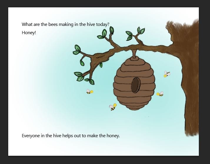
I am really pleased so far how well my images are turning out, despite taking a long time with all the layering of paint and small brush strokes I am doing. I am hoping my main characters which I will be designing next will go just as well.

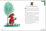
I need to start thinking also about the type of font I want for my pages. At the moment I am torn between keeping the book looking quite traditional and using a serif font with straight lines such as Times New Roman, or a more handwritten font (perhaps designing one myself) to keep the book looking child-like and also matching my messy/painted look images.

First stage of editing

I have begun editing my scanned in drawings – removing any white from the background and experimenting with different brush tools to add colour to my images.

I have added in the text of the story, however I want to look into more details about which type of font and size I want to use so for now I am just using what it is set as.

23.03.16 23.03.16 2

I like how the images are starting to look, and the fact you can see the brush strokes makes the image look more ‘authentic’ and ‘cute’ looking – similar to the Winnie the Pooh books!

I want to keep experimenting with different brush types and also maybe add in a faded background, maybe with a 30% opacity?

Layout designs

Before I start my storyboard I did some research in some different ways some children’s picture books have laid out their text and images.

The design layout that most appealed to me was the Winnie the Pooh designs. I like these because the images are purposefully  created to look as if they have been hand drawn, with the text placed around the images in the blank spaces. By placing the text almost ‘wrapped around’ the image I think it closely links them together, reinforcing the warm, family-orientated, comforting appeal the Winnie the Pooh books aim to create. In my storyboard I will use the books as inspiration for my layout.

First Draft Sketches

With a general idea for the theme, storyline and synopsis of my picture book, I began some sketches of characters and objects.

As I am not the best artist in the world, I thought logically about my drawings and decided to draw half of each character, so both sides would look identical. I may later decide to draw some more characters and/or versions of my characters so they can appear more than one in a different pose, but for now I want to experiment with some of these.

Now scanned in, I can start adding colour using the paint brush tools in Photoshop, and experiment watching YouTube tutorials on how to make these characters look more realistic.