Project One
Feedback Reflection
In our workshop this week I had a little catch up with Mike and discussed my typography work so far. The main two outputs of the conversation was;
- Whilst the phrase “Beautiful CHAOS” was good, I should mainly focus on the word ‘beautiful’ to be my final piece. (This I did agree on as whilst the word ‘chaos’ resembled what it was,I found it less interesting than ‘beautiful’)
- “Beautiful” needed something extra to be added to stand out more. ( i.e. another tight material to be wrapped round that was thicker and also had some colour too it. And also some kind of plaque or frame to present the work on/in.)
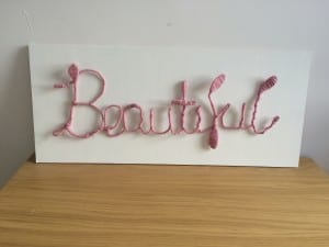
In response to this feedback I have already begun work on my type. I have bought a thick pink ball of wool which I have began wrapping around my letters tightly. I am already finding my work more visually appealing and the colour and texture of the wool is definitely emphasising each letters structure and format.
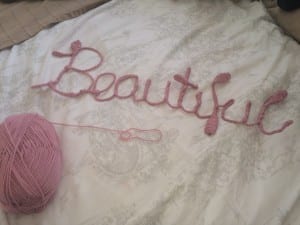
I also wanted to work on presenting my text better. I went out to B&Q and purchased a slab of MDF wood which I then painted white. By nailing the type onto the wood it should hopefully give it a more 3D look and the contrast in colours will emphasise the shape of the letters.
Typography design – Experiment #2
So I went ahead with my phrase “beautiful chaos” and started from scratch. For the word ‘beautiful’ I tightly twisted two wires with a drill and a clamp, and bent the wire into the letters. I created this word in a san serif typeface, conjoining each letter to create a flowing and elegant appearance. I then found a white coloured thinner wire and wrapped the type up in the wire.
I tried to measure and be as precise as I could in making sure all letters were the same height and all ascenders and descenders were the same height/length. However I found this hard when bending the wire and therefore the height of the ‘t’ is not as long as the ‘f’ and ‘l’. This is something I would ensure was correct if I was to do this project again. I do really like the white wire wrapped around – it doesn’t show very well on the picture and video however I like how the material used connotes the word well, similar to how onomatopoeia works with words and their sounds.
The second letter of the phrase was ‘chaos’ which I created in capital letters in a serif font. For this word I went with the wire structure of my first draft – a more random twisted, more angry looking structure (again to represent the meaning of the word). I used a different wire again for this, a dark purple coloured wire which again I’m afraid doesn’t show very well in the photos. I designed these letters separately and not joined together, but then connected them with a thin wire so they stay together.
The ‘H’ and ‘A’ I didn’t measure compared to the other letters and they ended up much larger than the other letters. In some ways I liked this; it reflects the meaning of the word and the structure and consistency of the letters is chaotic and uneven: but I also dislike how they aren’t neatly all the same height and width and can be used repeatedly as an actual typeface.
I visualise my font design typeface used as wall art: other phrases designed based around their meanings. I wanted to picture my work hanging on a wall however I couldn’t put nails into my wall at home so I photographed them on a white paper background – the image not as good as I envisioned however is all that I could do.
Typography design – Experiment #1
So, as my first attempt at my typography sculpture I chose the word “love” as when seen most in signs or slogans etc it is most commonly written in a serif font to represent its meaning. I began by sketching out the different fonts I wanted to use, and sketched the added wires and flowers I had planned on top.
And then the creation began. I used three or four wires at a time and twisted them in a irregular pattern and shaped them into the letters. I thought it would be easier if the letters were joined so then the wire could just be continuous… I then ran out of wire. Despite this, I added a couple of flowers to what I had of the word “love” to see if they worked well with the wire, and I loved the finished product!
As a first draft idea, I was pretty happy with my end result! However I wanted to change my idea so I had more letters for my final piece, with a variety of upper case and lower case to show my type design clearly. I searched through Google short quotes and sayings and discovered the quote I want to use, “Beautiful Chaos”. I also wanted to add more materials to my sculpture so I am on the hunt for ideas of metal/wiring I can use.
Typography in Context
My typography being a physical product, I have thought about places my work can be displayed. My favourite idea being wall art/decoration in houses.
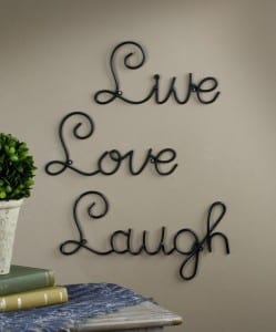
The majority of wall art which is quotes and words are designed in a serif font, so my own typography would fit in well. Here are a few of my favourites:
(http://www.cityhomeconstructions.com/decorate/spoken-wall-from-the-wall-art-words/attachment/metal-wall-art-words/)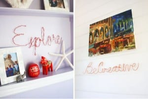 (http://www.brit.co/wire-word-wall-art/)
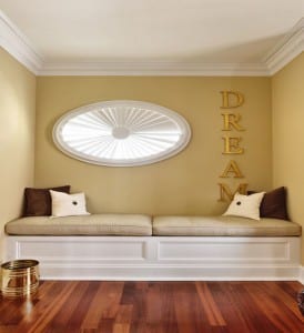 (http://www.decoradvisor.net/interior-design-2/typography-wall-art-to-style-inspirational-interiors/)
