Research into Timeline Infographics

After browsing round the internet I gathered a portion of what was hundreds of infographic timelines of Albert Einstein’s life.

A large amount of them were very text-heavy, something I want to steer away from as less text with an image is more effective then a paragraph.

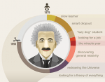
I wanted to relate my timeline to Einstein’s theory of relativity so thought again about his work. His revelation of ‘light travels faster than sound’ got me thinking about space, light and sound. From this little brainstorm, I developed the idea of my timeline being centred around a dash of light from space (a comet, shooting star, fire ball etc) and the top of the light will be his birth and the bottom being his death, with major events in his life going down the light source.

App and Website Research

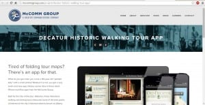
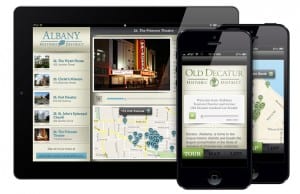
Whilst slowly developing my ideas for my website and app, I found an example of an app and website which incorporates a history element, something I was interested in doing.

app

The site appears to be very modern, using metallic colours of silver and blue to represent this. The structure and layout is one in which I hope mine will look as professional as, and I will try to do this by using features from this. (such as, a banner across the top, the main section being a mock-up one side and text the other, an image banner with text inside.)

work_mobile2_city1

The layout of the app looks very easy to access and manoeuvre around, and using a font for the text that looks from the 19th  century which fits in well with the objectives and aims of this app. The colours again are metallic and bland, and I hopefully want to avoid this by using a more vibrant colour but still representing the theme of my app.

Infographics

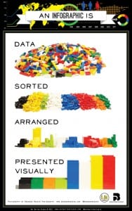
Infographics – What are they, and how are they used successfully?
what-is-an-infographic_50291a17367d7

Information graphics or infographics are graphic visual representations of information, data or knowledge intended to present information quickly and clearly. They can improve cognition by utilizing graphics to enhance the human visual system’s ability to see patterns and trends.” -(https://en.wikipedia.org/wiki/Infographic)


I searched for examples of infographics, designed for different audiences/purposes so I can start to get an idea of what audience I want to target for the project. I came across the website loveinfographics.com and found the following infographics;

1) “The Ultimate Bachelor Party Survival Guide”
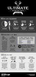
bachelor-party-guideWhat I have taken from this infographic:

  • Sticking to three colours is a good way to go about it – sections can be emphasised by a certain colour but by having more than two it makes it more appealing to look at.
  • Sectioning the infographic is a good structure: It could be designed as a ‘step-by-step’ guide or split into different points to make the information more clear


2) “Foods that make you smarter”

foods-that-make-you-smarter-INFOGRAPHICWhat I have  taken from this infographic:

  • Again, it sticks to a minimal 3 colours
  • There is almost an even mixture of text and images – it isn’t too packed full of text which makes the infographic look clearer to read
  • I have began to learn that a lot of infographics are in long rectangular strips, starting at the top and going through to the bottom


3) “It Pays To Hope” – (http://abduzeedo.com/cool-infographic-designs)
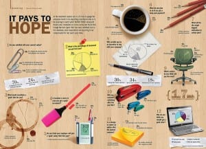
08What I like from this infographic:

  • I like how the images are photographs and placed in three columns to technically very organised, however they have a ‘scattered’ look.


4) Timeline of Video Games – (http://abduzeedo.com/cool-infographic-designs)
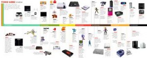
download What I liked about this infographic:

  • The simplicity of it – its a timeline with images, literally.
Brief for Project Two: Multi Format Data Visualisation

For our second project this semester is it all about adapting complex information, clearly and beautifully across a range of media platforms.

The information we need to be ….. is about Einstein’s General Theory of Relativity.

My starting point: Learn what he theory actually is…

Albert Einstein’s general theory of relativity is one of the towering achievements of 20th-century physics. Published in 1916, it explains that what we perceive as the force of gravity in fact arises from the curvature of space and time. Einstein proposed that objects such as the sun and the Earth change this geometry.” – (https://www.newscientist.com/round-up/instant-expert-general-relativity/)

In 1905, Albert Einstein determined that the laws of physics are the same for all non-accelerating observers, and that the speed of light in a vacuum was independent of the motion of all observers. This was the theory of special relativity. It introduced a new framework for all of physics and proposed new concepts of space and time.Einstein then spent 10 years trying to include acceleration in the theory and published his theory of general relativity in 1915. In it, he determined that massive objects cause a distortion in space-time, which is felt as gravity.” – (http://www.space.com/17661-theory-general-relativity.html)

Typography in Context

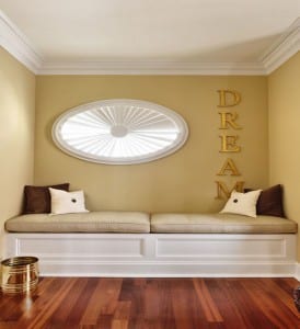
My typography being a physical product, I have thought about places my work can be displayed. My favourite idea being wall art/decoration in houses.

The majority of wall art which is quotes and words are designed in a serif font, so my own typography would fit in well. Here are a few of my favourites:

Metal-Wall-Art-Words-842x1014

(http://www.cityhomeconstructions.com/decorate/spoken-wall-from-the-wall-art-words/attachment/metal-wall-art-words/)
 
Capture
(http://www.brit.co/wire-word-wall-art/)
 
echelon-custom-homes-reading-room-decor-ideas-for-simple-living
(http://www.decoradvisor.net/interior-design-2/typography-wall-art-to-style-inspirational-interiors/)
 

(http://illusion.scene360.com/art/81984/fred-eerdekens/)