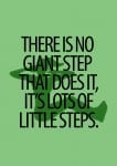
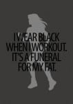
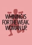
I had an idea to create motivational posters which would be scattered around the local area of my gym to persuade my target audience to join.
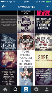
My idea grew from seeing motivational gym quotes on my Instagram news-feed and I wanted to create something similar.
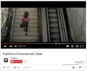
I went with the quote “ALWAYS USE THE STAIRS” which I had seen before on a gym wear advert “Fabletics” in the link here: VIDEO
At first I began by drawing out a woman and then a background which I first thought I could scan onto a computer and upload them into Photoshop and edit then together and add colour, then placing the text on top of the image in a thick san serif font.
I then thought over my idea and realised nothing else in my company branding would be drawn out, and the image won’t fit in with the rest of the branding of my campaign. So I started again, from scratch.
I wanted to keep it simple, but effective. I used my research of quotes and found a font that looked feminine, yet strong and powerful and ‘punchy’. I wanted to mix up my colour scheme and try out different colours to go with different quotes. I found silhouettes of women on Google images and imported them into the background in a different shade of the same colour.
This is just a first draft, and I will be altering my idea. I want to add my finalised logo into the bottom left corner, and also social media links such as Facebook, Instagram and Twitter and the companies website.
I have become very fond of this font I have used and I may use it as a branded font throughout this project. Also looking at this draft over all, I like the colours I have used and may look into branding these colours together somehow.
