Character Development

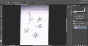
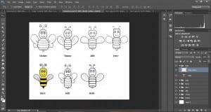
Before I continued with the rest of my book I completed the designs of my bee characters, using the sketches I uploaded and Photoshop. I have only worked on the one front pose for each character, and I want to experiment on using just this pose to start with, and then adding in other poses later on.


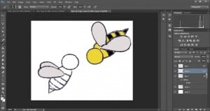
I started by removing the sketch and placing into a new blank canvas, removing the white and duplicating the sketch to make the other half of the bee.Character Development
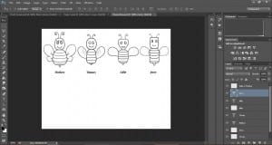
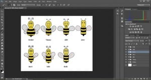
Secondly I went over the outline with a small black paintbrush to make the outline of the bees more visible. And then began colouring the characters in.

Character Development 2

I planned to use my sketch of the female bee for the character “Sally” however once edited the character looked more appropriate for the “Mother” character and I was short of a “Sally” and “Holly” bee. Using segments of different characters and editing them together, I was able to create the two new characters and distinguishing them somehow from the rest.

Character Development 3

My focus in creating these characters was to make an obvious difference in look between each of them, so it would be easy for my younger target audience to distinguish between the characters and be able to follow the storyline.
Page One Development

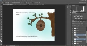
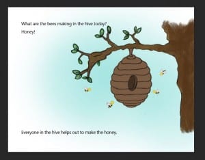
I have been using what I was taught in my design workshop on line painting to colour in my objects for my first page.

blog update2

blog update

blog update3

blog update4


I am really pleased so far how well my images are turning out, despite taking a long time with all the layering of paint and small brush strokes I am doing. I am hoping my main characters which I will be designing next will go just as well.

I need to start thinking also about the type of font I want for my pages. At the moment I am torn between keeping the book looking quite traditional and using a serif font with straight lines such as Times New Roman, or a more handwritten font (perhaps designing one myself) to keep the book looking child-like and also matching my messy/painted look images.

First Draft Sketches

With a general idea for the theme, storyline and synopsis of my picture book, I began some sketches of characters and objects.

As I am not the best artist in the world, I thought logically about my drawings and decided to draw half of each character, so both sides would look identical. I may later decide to draw some more characters and/or versions of my characters so they can appear more than one in a different pose, but for now I want to experiment with some of these.

Now scanned in, I can start adding colour using the paint brush tools in Photoshop, and experiment watching YouTube tutorials on how to make these characters look more realistic.

Colour Identity

Though out this project I have found deciding on a colour palette which will work the best for my target audience a very challenging aspect. Being a female only gym i wanted to avoid the stereotypical feminine colours such as pinks and purples, however without these it was difficult to make it obvious the brand was for females.


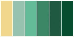
However I have decided, after gathering feedback from design students on my course, friends at home and my workshop tutor, I have created a colour swatch which includes all six colours I will be using in my package identity.

Final Colour Swatch.
  Final Colour Swatch.

COLOUR REPRESENTATIONS/MEANINGS:

Blue shades connote health, tranquillity and water. White connotes hygiene, cleanliness and goodness. Green shades are associated with nature and growth.

These representations combined  will implicate that this gym is a relaxing and positive place for women to work out comfortably.

Poster Development #2

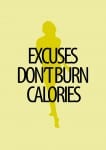
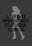
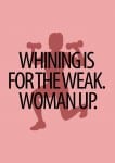
Working on branding my colour scheme I have altered the colours of my advertisement posters to pull and link all the designs to one identity.

My only worry with this is that the colours won’t attract as much attention as my bright pinks and yellows, however the colours I’ve changed them to are iconic of the brand and therefore people will automatically think of the brand Fitnessé even without seeing the small “F” logo.