I worked on my feedback and made the following changes;
1) I edited the comet on my Timeline Page.
2) Made the app able to zoom in so the text can be read more clearly
I worked on my feedback and made the following changes;
1) I edited the comet on my Timeline Page.
2) Made the app able to zoom in so the text can be read more clearly
So I showed Mike and the group my work and found the feedback very positive and useful;
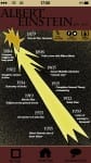
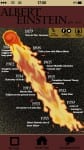
I started by creating the ‘home page’ for my app. I used the apps on my own phone for inspiration and imitated the layout. I created the signal circles, digital clock and battery along the top to make the app look more realistic for a mobile.
 The title “History Figures” is written in ‘Charlemagne Std Bold’ as the spikey serifs with the clean lines looks like a late twentieth century font which links to the historical factor of the app.
My choice in colours, stone, maroon and black, I feel connote an ‘old, history’ appeal, effective most when minimally used.
The cartoon characters of Pocahontas, Issac Newton and Cleopatra add an appealing factor for a possible younger audience. I got this idea from watching the children’s TV show ‘Horrible Histories’.
After feedback and advise on what to fill my homepage with, I have decided to fill the middle with pictures of historical landmarks which, when the app is functioning, will automatically fade into another random picture on a cycle of roughly 20 pictures. Below are three prototypes of what they would look like;


In our workshop this week I had a little catch up with Mike and discussed my typography work so far. The main two outputs of the conversation was;
In response to this feedback I have already begun work on my type. I have bought a thick pink ball of wool which I have began wrapping around my letters tightly. I am already finding my work more visually appealing and the colour and texture of the wool is definitely emphasising each letters structure and format.

I also wanted to work on presenting my text better. I went out to B&Q and purchased a slab of MDF wood which I then painted white. By nailing the type onto the wood it should hopefully give it a more 3D look and the contrast in colours will emphasise the shape of the letters.


So I went ahead with my phrase “beautiful chaos” and started from scratch. For the word ‘beautiful’ I tightly twisted two wires with a drill and a clamp, and bent the wire into the letters. I created this word in a san serif typeface, conjoining each letter to create a flowing and elegant appearance. I then found a white coloured thinner wire and wrapped the type up in the wire.
I tried to measure and be as precise as I could in making sure all letters were the same height and all ascenders and descenders were the same height/length. However I found this hard when bending the wire and therefore the height of the ‘t’ is not as long as the ‘f’ and ‘l’. This is something I would ensure was correct if I was to do this project again. I do really like the white wire wrapped around – it doesn’t show very well on the picture and video however I like how the material used connotes the word well, similar to how onomatopoeia works with words and their sounds.

The ‘H’ and ‘A’ I didn’t measure compared to the other letters and they ended up much larger than the other letters. In some ways I liked this; it reflects the meaning of the word and the structure and consistency of the letters is chaotic and uneven: but I also dislike how they aren’t neatly all the same height and width and can be used repeatedly as an actual typeface.

