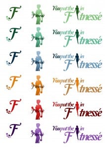
I have been working on my logo and slogan designs in Photoshop and have been experimenting with different colours to see which works best.

I can’t decide on whether to use the “F” or the silhouette of a woman for my main logo. I asked my design group and a member suggested using both; one for posters and business cards, and another for products and the website.In terms of colour, the second row seems to be the most popular/favourite among my design group.
After emailing my tutor I got the following feedback;
- He agrees that both logos can be used in different scenarios; signage and larger adverts would work with extra details, and for smaller cards ( E.g. my business card) the “F” would work better.
- The gap between the F and silhouette in the complete logo is awkwardly large and needs to be moved closer in.
- Neat and tidy so far
- Top three are favourites by colour, number one being top favourite