I worked on my feedback and made the following changes;
1) I edited the comet on my Timeline Page.
2) Made the app able to zoom in so the text can be read more clearly
I worked on my feedback and made the following changes;
1) I edited the comet on my Timeline Page.
2) Made the app able to zoom in so the text can be read more clearly
So I showed Mike and the group my work and found the feedback very positive and useful;
After creating my homepage for my app, I used the example of somebody searching for Albert Einstein. One they search the name they will be directed to 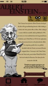
his page which will feature a large drawn image of the figure on the left side of the screen, and a short piece of text down the right explaining why this figure is so historic. I have kept the layout and colours of the screen the same as the homepage to keep the brand of the app continuous, sticking to the house colours of stone, maroon and black.
On Einstein’s page it gives the user two option; to view a timeline of Einstein’s life, or view some of his most famous quotes. I then created the pages to these two links to show what they would look like.
For my timeline I used an infographic to get across the information. Returning 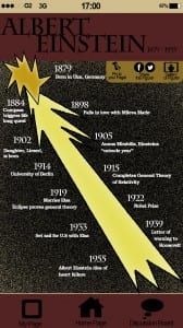 to the brief set and Einstein’s theory, I used his notion of ‘light travels faster than sound’ by focusing the timeline around a comet in space. Again this image has a ‘drawn’ effect which will be evident throughout my app and already seen on the homepage and on Einstein’s homepage. The comet represents Einstein’s life with his birth at the top and death at the bottom. I am considering adding small images next too each date to represent the event being stated however I want to work on my online desktop and A2 print first.
My final app page is the link from Einstein’s home page about his most famous 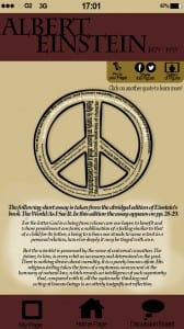 quotes. I created another infographic here; Because he was famously know for his attitudes towards science, religion and peace, I used a large hollow peace symbol and filled the icon with his most famous quotes. As the user clicks on a particular one, more information will appear below regarding that quote.
I thought this would be a unique way to display information that looks visually more appealing than if it was all written out.
I started by creating the ‘home page’ for my app. I used the apps on my own phone for inspiration and imitated the layout. I created the signal circles, digital clock and battery along the top to make the app look more realistic for a mobile.
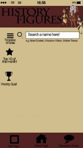 The title “History Figures” is written in ‘Charlemagne Std Bold’ as the spikey serifs with the clean lines looks like a late twentieth century font which links to the historical factor of the app.
My choice in colours, stone, maroon and black, I feel connote an ‘old, history’ appeal, effective most when minimally used.
The cartoon characters of Pocahontas, Issac Newton and Cleopatra add an appealing factor for a possible younger audience. I got this idea from watching the children’s TV show ‘Horrible Histories’.
After feedback and advise on what to fill my homepage with, I have decided to fill the middle with pictures of historical landmarks which, when the app is functioning, will automatically fade into another random picture on a cycle of roughly 20 pictures. Below are three prototypes of what they would look like;
In our workshop this week I had a little catch up with Mike and discussed my typography work so far. The main two outputs of the conversation was;
In response to this feedback I have already begun work on my type. I have bought a thick pink ball of wool which I have began wrapping around my letters tightly. I am already finding my work more visually appealing and the colour and texture of the wool is definitely emphasising each letters structure and format.
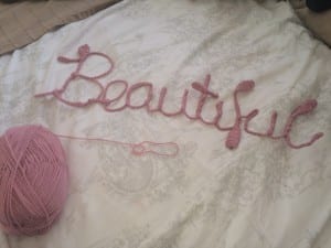
I also wanted to work on presenting my text better. I went out to B&Q and purchased a slab of MDF wood which I then painted white. By nailing the type onto the wood it should hopefully give it a more 3D look and the contrast in colours will emphasise the shape of the letters.