Picture Book: Initial Ideas

I am in the stage of coming up with a storyline/synopsis, themes, characters and titles for my book.

Theme – Conflict within Teamwork  – it is always best when we work together as a team

Storyline/Synopsis Ideas:

1)A male younger bee is intrigued by the outside world and doesn’t want to  work for the rest of his life with his family and friends at the hive. He flies out but end up finding it very lonely and scary, so returns home and appreciates more his family and friends.

2) Two bees go out to collect pollen but get lost. Go up to several characters/animals and say, “have you seen my hive?”

They reply “No, sorry”

eventually, by working together they find their ways home


3) What is cooking in the hive today? Honey!

Bee 1  finds a big patch of flowers

Bee 2 joins Bee 1 and does a bee dance to point other bees to the tasty nectar

Bee 3 and Bee 4 collects nectar from a flower and flies back to the hive

Bee 3 and 4 pass the honey to Bee 5 the house bee who puts it in the honeycombs of the hive

Bee 6 then covers the cap with wax to keep the honey safe

at dinner time, Bee 7 (who didnt help out) wants some food. But where what did Bee 7 do to help today? He did not find the flowers, he did not do the bee dance, he did not collect the nectar, he did not put it in the honeycomb and he did not keep it safe. Lazy Bee 7

(Need an outcome)

4) Similar to storyline 3, however instead of the bee not doing any work, he doesn’t do his job properly which means that the honey doesn’t get made and there is no food for everyone.

5) Again, similar to storyline 3 – the other bees are disappointed he didn’t help but still got to eat food so they don’t sit with him – therefore he learns to help out next time.

 Webpages I looked at for research and information:


Picture Book: Old Favourites

For this project I began by looking at some of my favourite books I read as a child.

The “Biff, Chip and Kipper” Books.

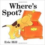
“Spot the Dog” Books

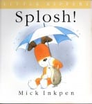
“Kipper” Books

“Dear Zoo” Book


I think they key to creating this picture book is not not over complicate my designs – if I keep them simple, I can add more, depending on how it looks.

I need to come up with my storyline, main characters and colour palette first, before I start thinking about my layout and sketching all my designs out.

I am hoping my upbringing with lots of younger siblings will be an advantage for me in this project, as I have lots of books to look at from home, as well as a history of reading a lot of them to my siblings when they were younger.

Poster Advertisements

I had an idea to create motivational posters which would be scattered around the local area of my gym to persuade my target audience to join.

IMG_2980


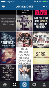
My idea grew from seeing motivational gym quotes on my Instagram news-feed and I wanted to create something similar.


fabletics
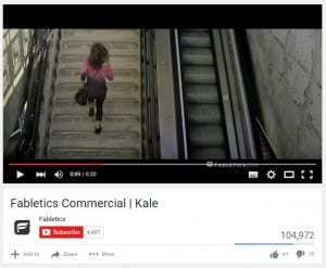
“You wake up early for a morning spin, you gave up carbs, you eat kale, the weather is never an excuse, you dance to burn calories, you always take the stairs. You work so hard trying to look good, you should look good while you’re doing it.


I went with the quote “ALWAYS USE THE STAIRS” which I had seen before on a gym wear advert “Fabletics” in the link here: VIDEO


At first I began by drawing out a woman and then a background which I first thought I could scan onto a computer and upload them into Photoshop and edit then together and add colour, then placing the text on top of the image in a thick san serif font.

I then thought over my idea and realised nothing else in my company branding would be drawn out, and the image won’t fit in with the rest of the branding of my campaign. So I started again, from scratch.

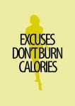
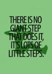
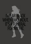
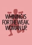
I wanted to keep it simple, but effective. I used my research of quotes and found a font that looked feminine, yet strong and powerful and ‘punchy’. I wanted to mix up my colour scheme and try out different colours to go with different quotes. I found silhouettes of women on Google images and imported them into the background in a different shade of the same colour.

This is just a first draft, and I will be altering my idea. I want to add my finalised logo into the bottom left corner, and also social media links such as Facebook, Instagram and Twitter and the companies website.

I have become very fond of this font I have used and I may use it as a branded font throughout this project. Also looking at this draft over all, I like the colours I have used and may look into branding these colours together somehow.

Fitnessé: Initial Branding Ideas/Aims

I have decided for this project i would take up the ‘Fitnessé’ company, producing a brand for an all female gym.

As a gym-gooer myself, i look around me and think about what my own inspirations are for going to the gym. I have come to realise that for people of my age (18-25) a large amount of this inspiration and motivation comes from social medias. I constantly see images of women on the internet described to have the ‘perfect figure’, alongside inspiring quotes aimed to motivate women to get to the gym and become closer to the woman you aspire to look like and believe that it is possible. Without sounding like a stereotypical young female, it actually works and makes me feel guilty if i don’t go!

Saying all this, that technique works for young students who have plenty of free time to actually go to the gym, but i want my branding to appeal to women of all ages. I need to think of an aspect that will make the gym easy and accessible (other than having open 24 hours) that will encourage busy mums or workaholics to be able to join also.

The last idea i have in mind which i want to include in my company package is that Fitnessé is not limited to women of one body size, and that all shapes and sizes are welcome to join, with leaflets of exercises tailored to specific parts of the body for women of different shapes. I had an idea to sketch out female body shapes which are all different in hight, weight and size, similar to how Dove advertises its deodorant products, and have the image incorporated into the branding somehow.

Poster Research and Planning

I wanted my poster to continue the History Figures brand and decided to use it as an advertisement poster for the website and app. I began by looking at what other website posters look like, as its not something you see very often as websites are usually advertised online.

The posters I saw were very text heavy, with lots of big objects and colours going on, and the majority of them featuring a screen with the website displayed. I picked a sample from the ones I was looking at;

 PLANS

I want to steer away from these concepts and create a very minimalistic poster. I am thinking of creating a poster with a blank background, possibly white rather than the stone in my other pieces, with the ‘History Figures’ logo in the top corner. I want my information to be floating around the page inside objects, this way, the viewer will be steered to focus solely on the information. I will stick to my house colours of white, black, maroon and stone to keep the continuity of the brand going. The layout of the poster is definitely going to be different from my other two pieces, having a more ‘free’ and ‘floaty’ structure rather than a firm structure.