Type/Logo Moodboard

I have been playing around on Photoshop looking for the perfect font for my company brand which will be incorporated throughout the brand package.

LOGO FONTS IDEAS

I also tried including an image of a running woman into the slogan/logo. I began fiddling around with images I found online and manipulating the text with a image I found online in Photoshop. I came up with these as my first initial logo for the company which can be used on a business card, brochure and website: Still with much development to work on.


Fitnessé: Initial Branding Ideas/Aims

I have decided for this project i would take up the ‘Fitnessé’ company, producing a brand for an all female gym.

As a gym-gooer myself, i look around me and think about what my own inspirations are for going to the gym. I have come to realise that for people of my age (18-25) a large amount of this inspiration and motivation comes from social medias. I constantly see images of women on the internet described to have the ‘perfect figure’, alongside inspiring quotes aimed to motivate women to get to the gym and become closer to the woman you aspire to look like and believe that it is possible. Without sounding like a stereotypical young female, it actually works and makes me feel guilty if i don’t go!

Saying all this, that technique works for young students who have plenty of free time to actually go to the gym, but i want my branding to appeal to women of all ages. I need to think of an aspect that will make the gym easy and accessible (other than having open 24 hours) that will encourage busy mums or workaholics to be able to join also.

The last idea i have in mind which i want to include in my company package is that Fitnessé is not limited to women of one body size, and that all shapes and sizes are welcome to join, with leaflets of exercises tailored to specific parts of the body for women of different shapes. I had an idea to sketch out female body shapes which are all different in hight, weight and size, similar to how Dove advertises its deodorant products, and have the image incorporated into the branding somehow.

Poster Research and Planning

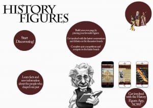
I wanted my poster to continue the History Figures brand and decided to use it as an advertisement poster for the website and app. I began by looking at what other website posters look like, as its not something you see very often as websites are usually advertised online.

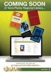
The posters I saw were very text heavy, with lots of big objects and colours going on, and the majority of them featuring a screen with the website displayed. I picked a sample from the ones I was looking at;

 PLANS

I want to steer away from these concepts and create a very minimalistic poster. I am thinking of creating a poster with a blank background, possibly white rather than the stone in my other pieces, with the ‘History Figures’ logo in the top corner. I want my information to be floating around the page inside objects, this way, the viewer will be steered to focus solely on the information. I will stick to my house colours of white, black, maroon and stone to keep the continuity of the brand going. The layout of the poster is definitely going to be different from my other two pieces, having a more ‘free’ and ‘floaty’ structure rather than a firm structure.