Website Research

Searching the internet I found a ladies only gym, and captured some key aspects of the design layout and branding.

“GO30” is the gym advertised in the website below. The four slides are the first main part of the website, and it slides on a timer onto the next page showing different opportunities the gym brings. I like this layout, however without having a gym to photograph for mine i think the idea wouldn’t work very well for this project brief.

The next aspect of the website as I looked at was the “About us” section with two areas:

The first is a description about the gym and its aims and objectives. The second aspect was a “5 steps to a better you” which were five aspects the gym offers to attract every type of woman, making the workout part of a easy routine to get into. This aspect I really liked and want to incorporate this idea into my own.

Logo Research

I begin my logo development by looking at existing gym logos. I simply searched into Google “Gym Logos” and below is a selection from what I found.

gym logo research I found the colour scheme for the majority of the results to be very dull – mostly black, white and grey colours. This wasn’t what I expect if I am honest, I thought a gym brand/logo would incorporate bright vibrant colours to motivate and excite members. Secondly I noticed that a large amount featured a muscular male figure and a barbell. This is something I want to steer away from as I want my logo to differ from every other gym logo out there. The third thing I noticed was the amount of straight lines and compact designs in the logo, assuming it represents strength, stability and power from attending that gym.

I then searched “female gym logos” to see if there were much difference in the designs, turns out there was.

female gym logos Straight away all aspects I pointed out above have changed in order to appeal to a female audience; pinks and purples have been incorporated into the colour scheme to provide a feminine touch, more curved lines and strokes are used in italic fonts and the muscular image of a male has turned into a toned female body.

Motivational Gym Quotes

“STRENGTH IS BEAUTIFUL”

“NOTHING TASTES AS GOOD AS HEALTHY FEELS”

“YOU HAVEN’T FAILED UNTIL YOU QUIT TRYING”

“SUCK IT UP NOW AND YOU WON’T HAVE TO SUCK IT IN LATER”

“EXCUSES DON’T BURN CALORIES”

“I WEAR BLACK WHEN I WORKOUT. ITS A FUNERAL FOR MY FAT.”

“LET EXERCISE BE THE STRESS RELIEVER, NOT FOOD”

“WHINING IS FOR THE WEAK. WOMAN UP”

“SHUT UP AND SQUAT”

Possible Company Slogan: “I PUT THE I IN FITNESSE”


Poster Research and Planning

I wanted my poster to continue the History Figures brand and decided to use it as an advertisement poster for the website and app. I began by looking at what other website posters look like, as its not something you see very often as websites are usually advertised online.

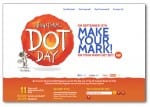
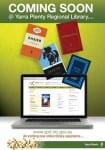
The posters I saw were very text heavy, with lots of big objects and colours going on, and the majority of them featuring a screen with the website displayed. I picked a sample from the ones I was looking at;

 PLANS

I want to steer away from these concepts and create a very minimalistic poster. I am thinking of creating a poster with a blank background, possibly white rather than the stone in my other pieces, with the ‘History Figures’ logo in the top corner. I want my information to be floating around the page inside objects, this way, the viewer will be steered to focus solely on the information. I will stick to my house colours of white, black, maroon and stone to keep the continuity of the brand going. The layout of the poster is definitely going to be different from my other two pieces, having a more ‘free’ and ‘floaty’ structure rather than a firm structure.


Online desktop Research

I want to keep all my elements of this project linked with a strong brand and therefore my online desktop will be the website homepage for ‘History Figures’.

For the layout of my webpage, I want to stick to ‘simplicity’ as my main aim so my users can navigate the site easily. I spent some time looking at popular websites; Facebook, Instagram, Twitter and Cbbc sites.

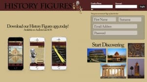
I took inspiration from the Cbbc and Facebook sites, and created a top bar on my site, including the sites name and a log in area. I then used a PSD Mock-up and placed my app pages onto mobile devices to influence users to get involved using the app, similar to Instagram’s homepage. On the Cbbc site, I liked how they had sections stuck out and filled with an image. I incorporated this into my own webpage and had a ‘Start Discovering’ area displaying images that will be on the site once they log in.

Online Desktop