First Draft Sketches

With a general idea for the theme, storyline and synopsis of my picture book, I began some sketches of characters and objects.

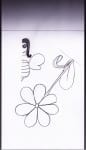
As I am not the best artist in the world, I thought logically about my drawings and decided to draw half of each character, so both sides would look identical. I may later decide to draw some more characters and/or versions of my characters so they can appear more than one in a different pose, but for now I want to experiment with some of these.

Now scanned in, I can start adding colour using the paint brush tools in Photoshop, and experiment watching YouTube tutorials on how to make these characters look more realistic.

Colour Identity

Though out this project I have found deciding on a colour palette which will work the best for my target audience a very challenging aspect. Being a female only gym i wanted to avoid the stereotypical feminine colours such as pinks and purples, however without these it was difficult to make it obvious the brand was for females.


However I have decided, after gathering feedback from design students on my course, friends at home and my workshop tutor, I have created a colour swatch which includes all six colours I will be using in my package identity.

Final Colour Swatch.
  Final Colour Swatch.

COLOUR REPRESENTATIONS/MEANINGS:

Blue shades connote health, tranquillity and water. White connotes hygiene, cleanliness and goodness. Green shades are associated with nature and growth.

These representations combined  will implicate that this gym is a relaxing and positive place for women to work out comfortably.

Poster Development #2

Working on branding my colour scheme I have altered the colours of my advertisement posters to pull and link all the designs to one identity.

My only worry with this is that the colours won’t attract as much attention as my bright pinks and yellows, however the colours I’ve changed them to are iconic of the brand and therefore people will automatically think of the brand Fitnessé even without seeing the small “F” logo.


Website Development #2

Today I have been working on my website development. Compared to my last post it has changed a lot! I wanted to keep the hexagon format to be part of the layout as I think it looks interesting to look at as well as being a unique way to click onto another page, rather than having the standard bar with tabs along the top of the screen.

2. WEBSITE blog update

This shows what the hexagons would look like once hovered over by a mouse. Obviously not all at once, but this image shows what each hexagon would say, and the page it would link too.

My colour scheme I have chosen blue, turquoise and greens as I feel the neutral colours add a relaxed approach to the gym, rather than the hard tough approach most gyms go for. However I want to conduct more research into what these colours connote, and create a colour swatch of the exact colours I am using.

Logo and Slogan Development

I have been working on my logo and slogan designs in Photoshop and have been experimenting with different colours to see which works best.

LOGO IDEAS 2
 I can’t decide on whether to use the “F” or the silhouette of a woman for my main logo. I asked my design group and a member suggested using both; one for posters and business cards, and another for products and the website.In terms of colour, the second row seems to be the most popular/favourite among my design group.

After emailing my tutor I got the following feedback;

  • He agrees that both logos can be used in different scenarios; signage and larger adverts would work with extra details, and for smaller cards ( E.g. my business card) the “F” would work better.
  • The gap between the F and silhouette in the complete logo is awkwardly large and needs to be moved closer in.
  • Neat and tidy so far
  • Top three are favourites by colour, number one being top favourite