Website Development

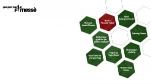
I have begun working on my website development and layout, with an idea for the layout of the screen.

Using a hexagon shape they would be the links to other areas of the site, and as you hover over them the link to the page in which it will be taking you will pop up. As I am unsure with my colour palette yet I am experimenting with green and red so far.

WEBSITE DEVELOPMENT 1  WEBSITE VERSION 2 DEVELOPMENT 1

App Development, Pages 2, 3 and 4

After creating my homepage for my app, I used the example of somebody searching for Albert Einstein. One they search the name they will be directed to Einstein Page 1
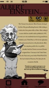
his page which will feature a large drawn image of the figure on the left side of the screen, and a short piece of text down the right explaining why this figure is so historic. I have kept the layout and colours of the screen the same as the homepage to keep the brand of the app continuous, sticking to the house colours of stone, maroon and black.

On Einstein’s page it gives the user two option; to view a timeline of Einstein’s life, or view some of his most famous quotes. I then created the pages to these two links to show what they would look like.

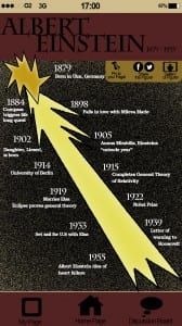
For my timeline I used an infographic to get across the information. Returning Einstein Page 2 Timelineto the brief set and Einstein’s theory, I used his notion of ‘light travels faster than sound’ by focusing the timeline around a comet in space. Again this image has a ‘drawn’ effect which will be evident throughout my app and already seen on the homepage and on Einstein’s homepage. The comet represents Einstein’s life with his birth at the top and death at the bottom. I am considering adding small images next too each date to represent the event being stated however I want to work on my online desktop and A2 print first.
 

My final app page is the link from Einstein’s home page about his most famous Einstein Page 3 Quotesquotes. I created another infographic here; Because he was famously know for his attitudes towards science, religion and peace, I used a large hollow peace symbol and filled the icon with his most famous quotes. As the user clicks on a particular one, more information will appear below regarding that quote.
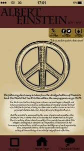
I thought this would be a unique way to display information that looks visually more appealing than if it was all written out.
 

Proposed Idea for Project Two

After finally defeating my blank mind, I have an idea!

For this project I will be creating an informative website, which will also have an app, and an advertisement poster for the website. The website will be called “Historic Figures” and will hold information about famous figures from our past including a gallery of images, timeline of their lives, facts and figures about them, and a short bibliography about them. The website allows the audience to have their own “page” where they can bookmark figures and create a scrapbook of information they want to remember. There will be discussion boards so users can chat to other users and they will also be able to share links via Facebook, Twitter, blogs and other social media’s.

Linking back to Albert Einstein’s theory….

The pages of the apps I will be focusing on will be Einstein; a page with an overview of why he is so historic, a page with a timeline of his life (as an infographic), and a page of his famous quotes (also as an infographic) which when you hover over them with your curser it will reveal more information relating to that particular quote.

Typography design – Experiment #2

So I went ahead with my phrase “beautiful chaos” and started from scratch. For the word ‘beautiful’ I tightly twisted two wires with a drill and a clamp, and bent the wire into the letters. I created this word in a san serif typeface, conjoining each letter to create a flowing and elegant appearance. I then found a white coloured thinner wire and wrapped the type up in the wire.

I tried to measure and be as precise as I could in making sure all letters were the same height and all ascenders and descenders were the same height/length. However I found this hard when bending the wire and therefore the height of the ‘t’ is not as long as the ‘f’ and ‘l’. This is something I would ensure was correct if I was to do this project again. I do really like the white wire wrapped around – it doesn’t show very well on the picture and video however I like how the material used connotes the word well, similar to how onomatopoeia works with words and their sounds.

IMG_2500


The second letter of the phrase was ‘chaos’ which I created in capital letters in a serif font. For this word I went with the wire structure of my first draft – a more random twisted, more angry looking structure (again to represent the meaning of the word). I used a different wire again for this, a dark purple coloured wire which again I’m afraid doesn’t show very well in the photos. I designed these letters separately and not joined together, but then connected them with a thin wire so they stay together.

The ‘H’ and ‘A’  I didn’t measure compared to the other letters and they ended up much larger than the other letters. In some ways I liked this; it reflects the meaning of the word and the structure and consistency of the letters is chaotic and uneven: but I also dislike how they aren’t neatly all the same height and width and can be used repeatedly as an actual typeface.

IMG_2501


I visualise my font design typeface used as wall art: other phrases designed based around their meanings. I wanted to picture my work hanging on a wall however I couldn’t put nails into my wall at home so I photographed them on a white paper background – the image not as good as I envisioned however is all that I could do.

IMG_2502


Typography design – Experiment #1

So, as my first attempt at my typography sculpture I chose the word “love” as when seen most in signs or slogans etc it is most commonly written in a serif font to represent its meaning. I began by sketching out the different fonts I wanted to use, and sketched the added wires and flowers I had planned on top.

IMG_2435

And then the creation began. I used three or four wires at a time and twisted them in a irregular pattern and shaped them into the letters. I thought it would be easier if the letters were joined so then the wire could just be continuous… I then ran out of wire. Despite this, I added a couple of flowers to what I had of the word “love” to see if they worked well with the wire, and I loved the finished product!

As a first draft idea, I was pretty happy with my end result! However I wanted to change my idea so I had more letters for my final piece, with a variety of upper case and lower case to show my type design clearly. I searched through Google short quotes and sayings and discovered the quote I want to use, “Beautiful Chaos”. I also wanted to add more materials to my sculpture so I am on the hunt for ideas of metal/wiring I can use.