Poster Development #2

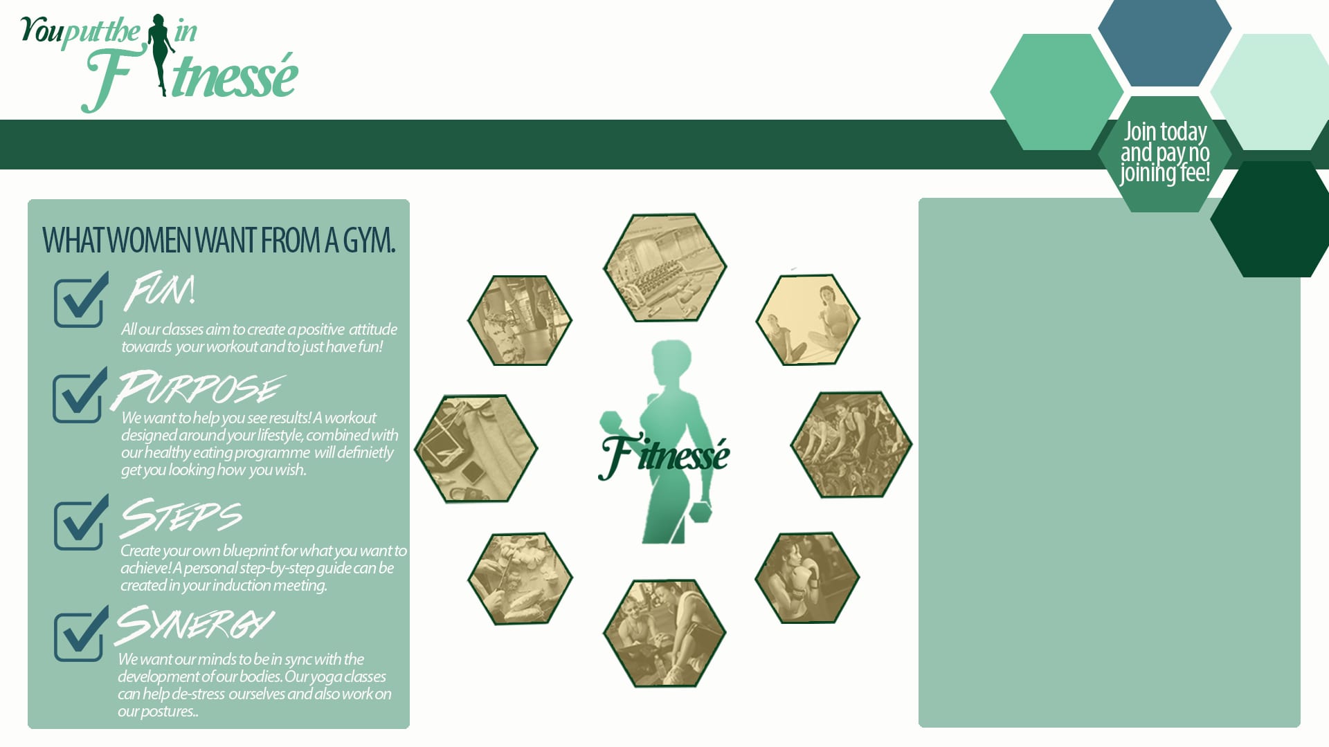
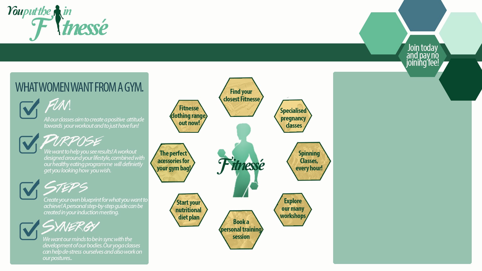
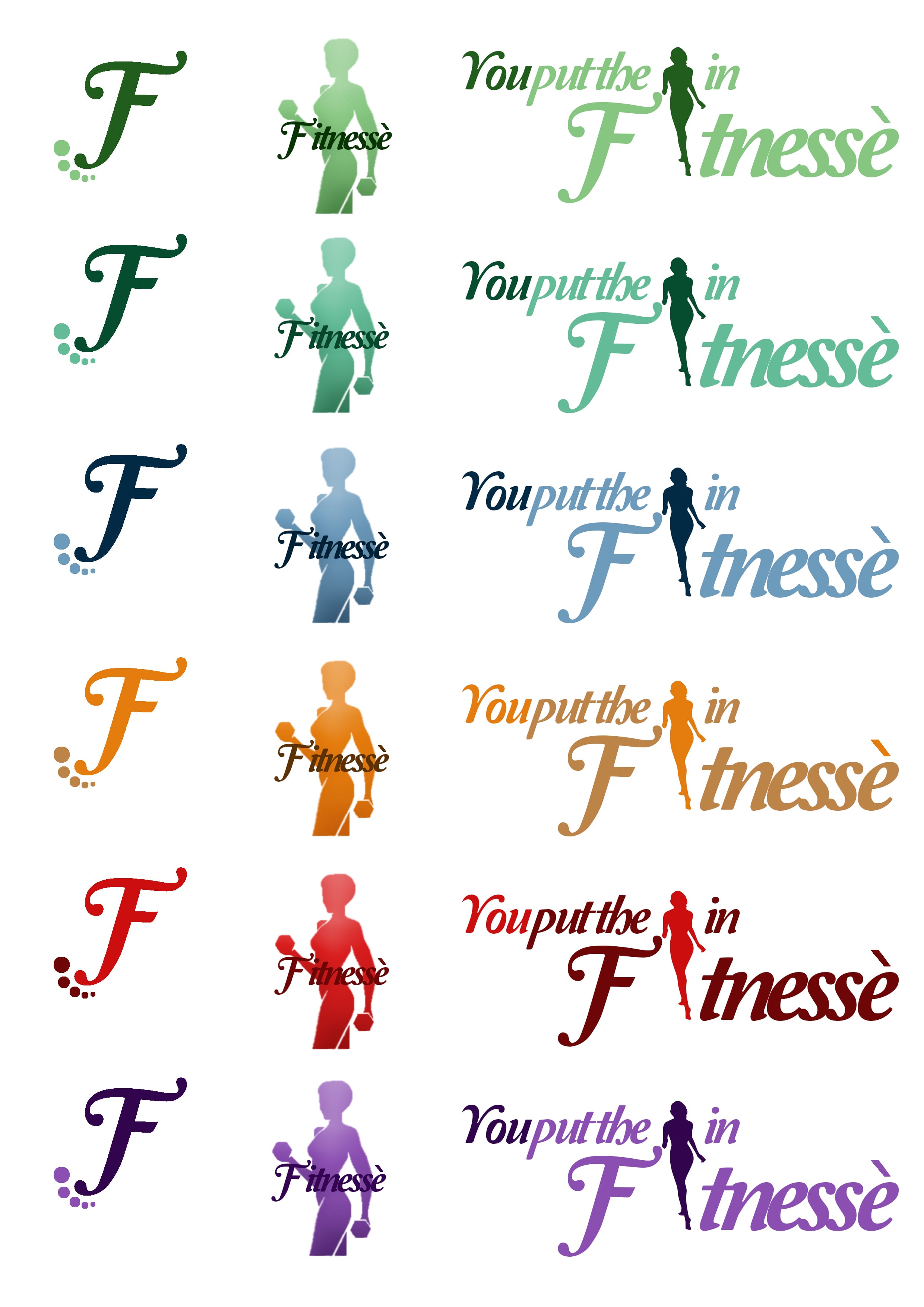
Working on branding my colour scheme I have altered the colours of my advertisement posters to pull and link all the designs to one identity.

My only worry with this is that the colours won’t attract as much attention as my bright pinks and yellows, however the colours I’ve changed them to are iconic of the brand and therefore people will automatically think of the brand Fitnessé even without seeing the small “F” logo.


Website Development #2

Today I have been working on my website development. Compared to my last post it has changed a lot! I wanted to keep the hexagon format to be part of the layout as I think it looks interesting to look at as well as being a unique way to click onto another page, rather than having the standard bar with tabs along the top of the screen.

2. WEBSITE blog update

This shows what the hexagons would look like once hovered over by a mouse. Obviously not all at once, but this image shows what each hexagon would say, and the page it would link too.

My colour scheme I have chosen blue, turquoise and greens as I feel the neutral colours add a relaxed approach to the gym, rather than the hard tough approach most gyms go for. However I want to conduct more research into what these colours connote, and create a colour swatch of the exact colours I am using.

Website Research

Searching the internet I found a ladies only gym, and captured some key aspects of the design layout and branding.

“GO30” is the gym advertised in the website below. The four slides are the first main part of the website, and it slides on a timer onto the next page showing different opportunities the gym brings. I like this layout, however without having a gym to photograph for mine i think the idea wouldn’t work very well for this project brief.

The next aspect of the website as I looked at was the “About us” section with two areas:

The first is a description about the gym and its aims and objectives. The second aspect was a “5 steps to a better you” which were five aspects the gym offers to attract every type of woman, making the workout part of a easy routine to get into. This aspect I really liked and want to incorporate this idea into my own.

Logo and Slogan Development

I have been working on my logo and slogan designs in Photoshop and have been experimenting with different colours to see which works best.

LOGO IDEAS 2
 I can’t decide on whether to use the “F” or the silhouette of a woman for my main logo. I asked my design group and a member suggested using both; one for posters and business cards, and another for products and the website.In terms of colour, the second row seems to be the most popular/favourite among my design group.

After emailing my tutor I got the following feedback;

  • He agrees that both logos can be used in different scenarios; signage and larger adverts would work with extra details, and for smaller cards ( E.g. my business card) the “F” would work better.
  • The gap between the F and silhouette in the complete logo is awkwardly large and needs to be moved closer in.
  • Neat and tidy so far
  • Top three are favourites by colour, number one being top favourite


Website Development

I have begun working on my website development and layout, with an idea for the layout of the screen.

Using a hexagon shape they would be the links to other areas of the site, and as you hover over them the link to the page in which it will be taking you will pop up. As I am unsure with my colour palette yet I am experimenting with green and red so far.

WEBSITE DEVELOPMENT 1  WEBSITE VERSION 2 DEVELOPMENT 1